GP Build
The GP Building Products team needed a new website that effectively presents their brand and services in a modern, yet still familiar way.
GP Build (for short) is a division within Georgia Pacific targeting the building and construction market with their products. Their current website needed a refresh, but more importantly, they required a design that leverages recent web innovations to create an optimal user experience.
To expedite the process, the GP Build team partnered with Deloitte as their development team and my agency as the design team. Our collaborative approach began with creating a style guide for the Deloitte team to use as building blocks for creating the authenticated view. Once the style guide was approved, we applied it to develop various templates showcasing the desired look and feel. I worked collaboratively with the Deloitte team as well as my own team to iterate through each page for desktop and mobile.
RESPONSIBILITIES
Visual Design
UX Design
QA
TEAM
Ashley Rothrock - Creative Director
Emily Griffen (EG) - UX Designer
John Robertson - Sr Developer
Sheridan Falkenberry - Project Manager
DELIVERABLES
Annotated Wireframes
Desktop Designs
Mobile Designs
Style Guide
TIMELINE
2023
Building the
Foundation
This style guide is also a build guide. It included the nuts and bolts, but also the design philosophy.
Noting not just colors, typography, button styles, and icons, the style guide also covers how content is organized and displayed on the site, guidelines for structuring pages according to the design language we've established, and the interactions between elements on the page.
Creating a working style guide that can adapt and change at a moment’s notice.
FLEXIBILITY
A design system built in Figma became our foundation.
VISIBILITY
The style guide became a working prototype to show the most up-to-date version.
COLLABORATION
Being in the same file allowed everyone to share and work together.
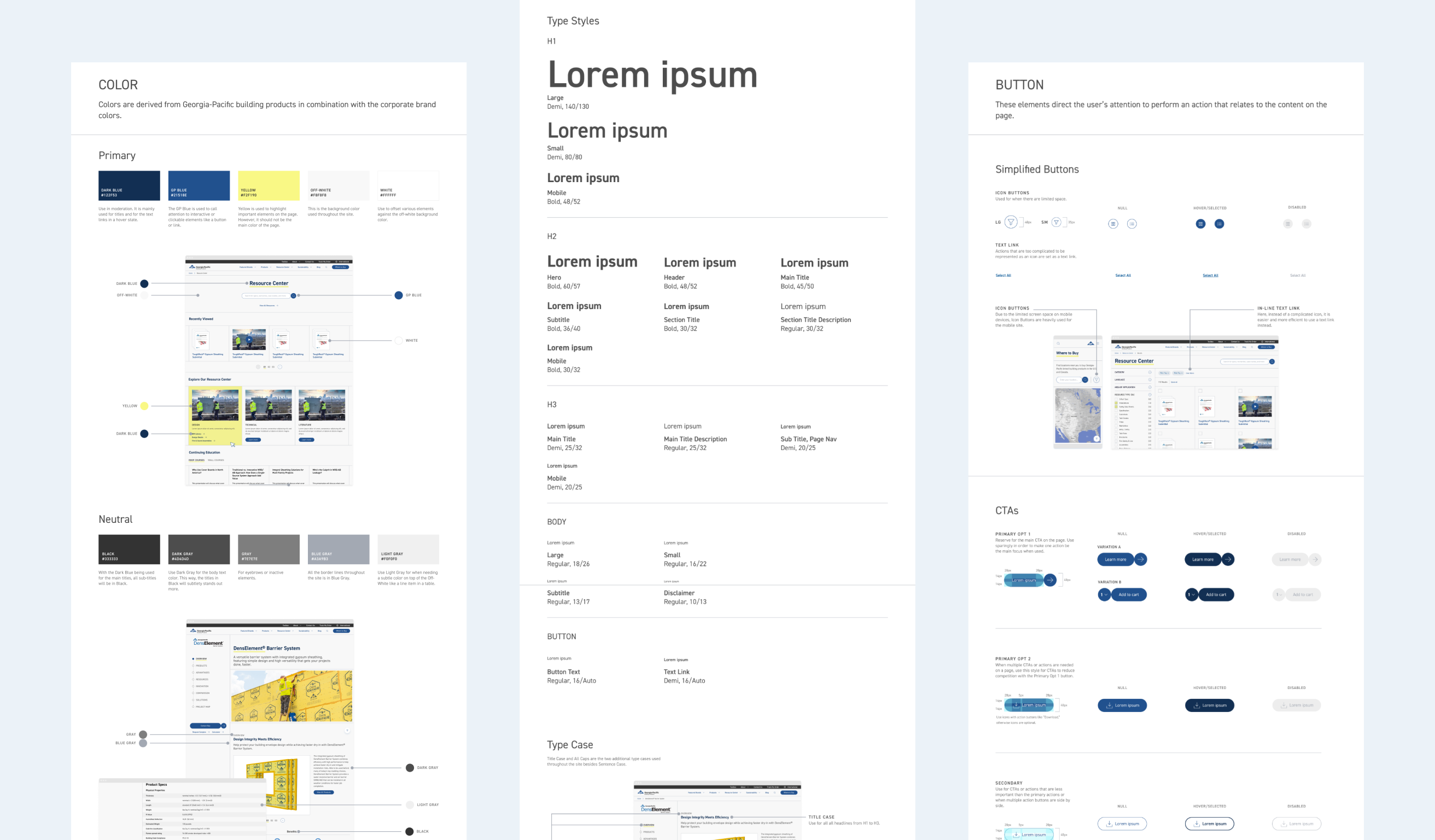
CORE ELEMENTS
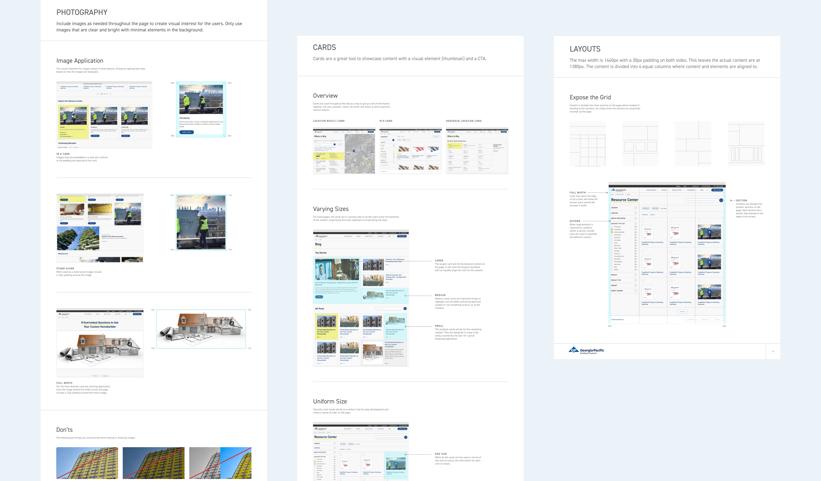
Everything a typical style guide would include such as color usage, typography hierarchy, button styles and instances, photography usage, icon style, etc.
CONTENT
The style guide touched on how to organize and divide the content on a page into sections or small cards. In addition, we also explained how to navigate large content via in-line navigation or tabs.
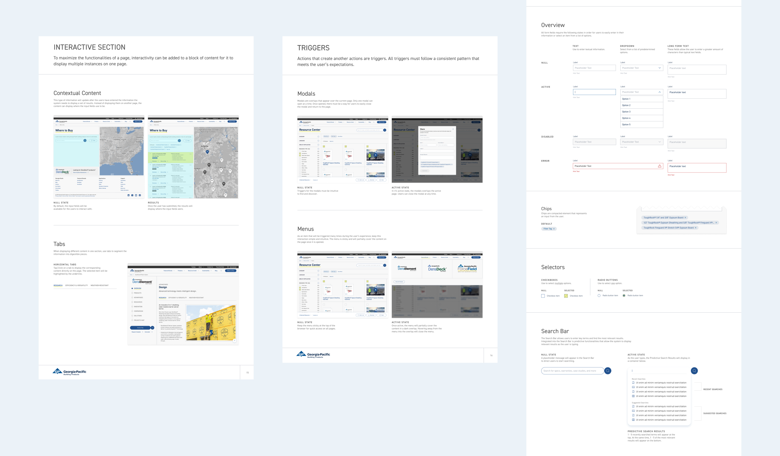
INTERACTION
Like all modern websites, interactions helped inform the users of a state change. How users interact with various elements on the page and how the site should respond are noted in the style guide.
The style guide also helped inform the design system. From colors and font styles to all component variances, having it beforehand shortened the work as I built out other instances and states.
Evaluate and
Optimize Each Page
I looked at each page and see where I can improve the efficiency and user experience.
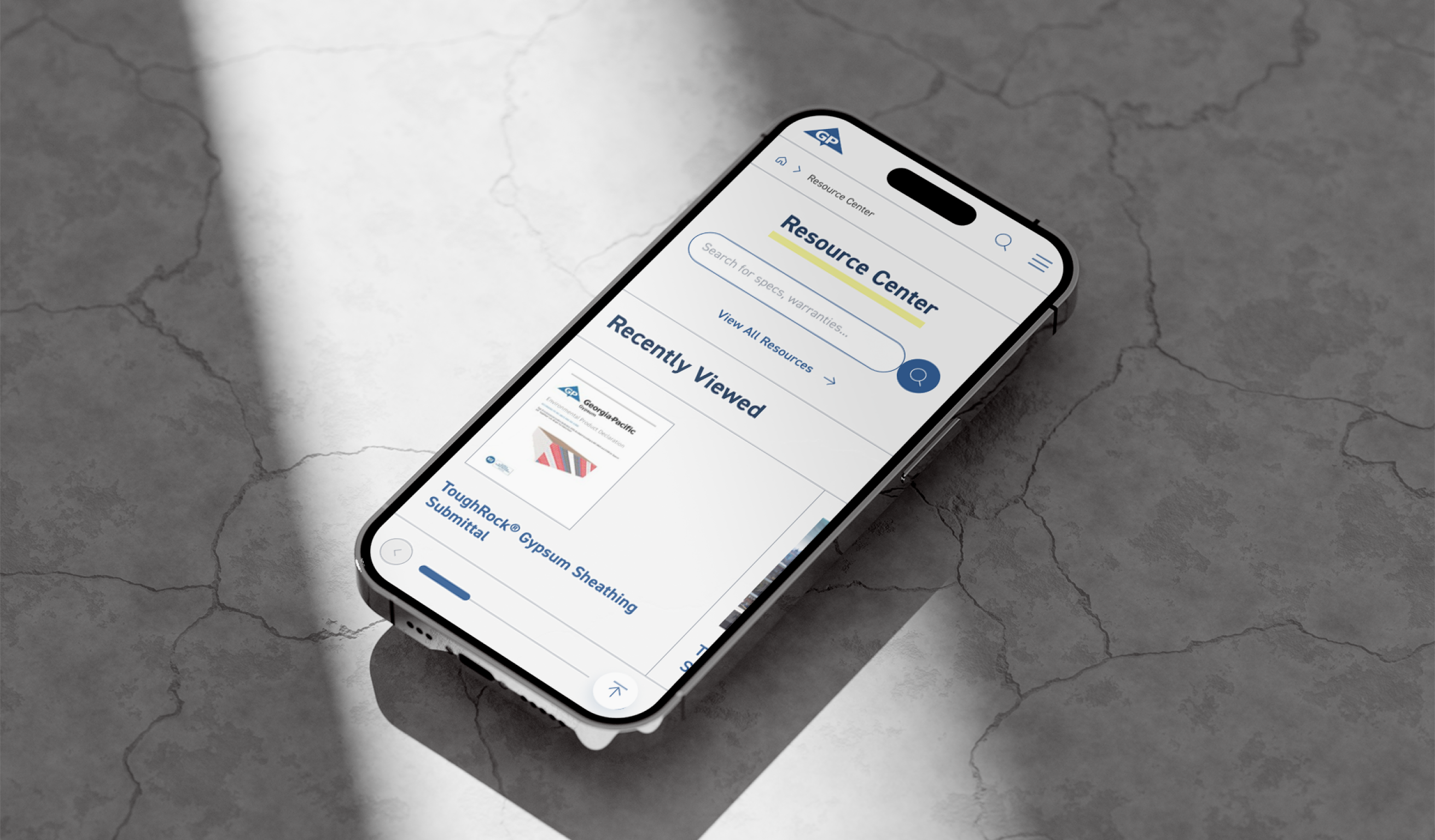
When I sat down to redesign the GP Build website, the core intent was first and foremost to optimize the user experience so that their reading and interactive experience will be more efficient, easy, and users leave with the knowledge they came to seek.
AREAS OF FOCUS
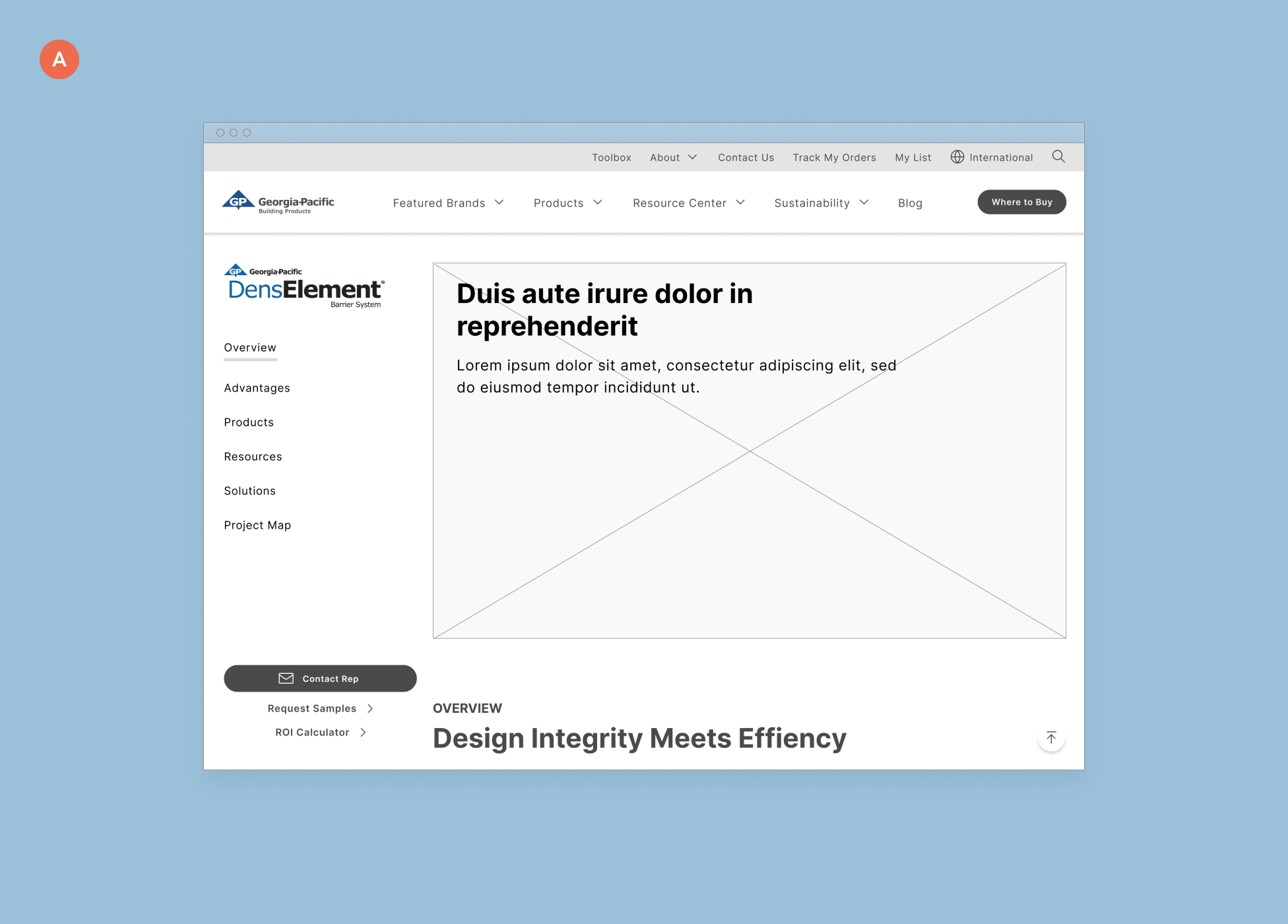
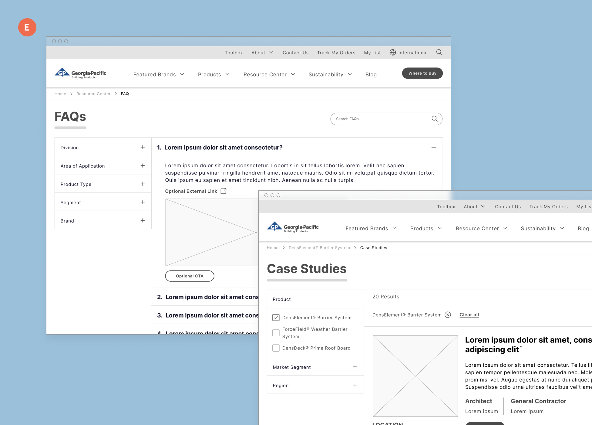
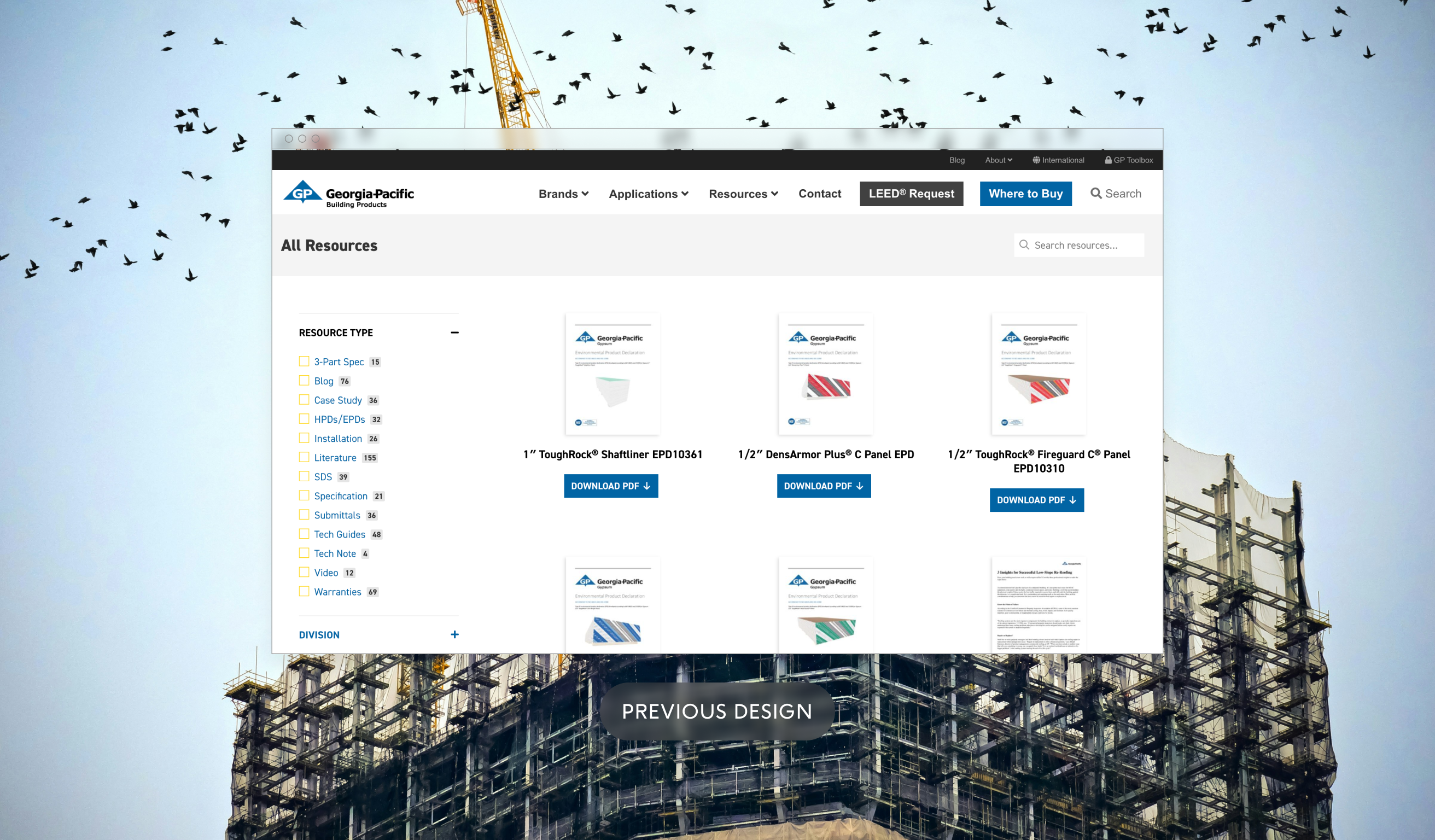
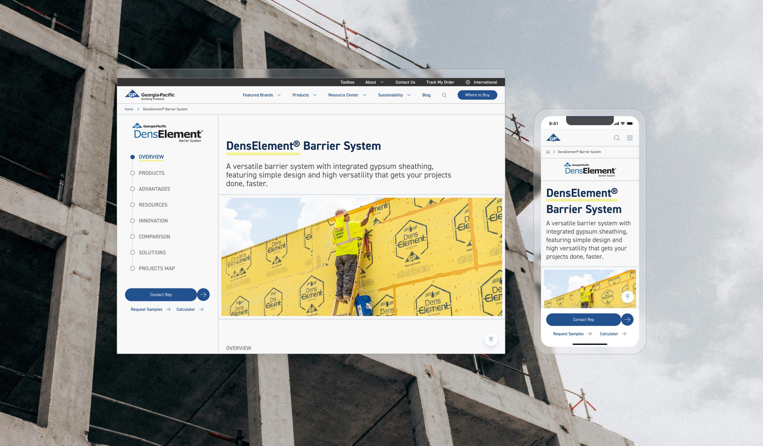
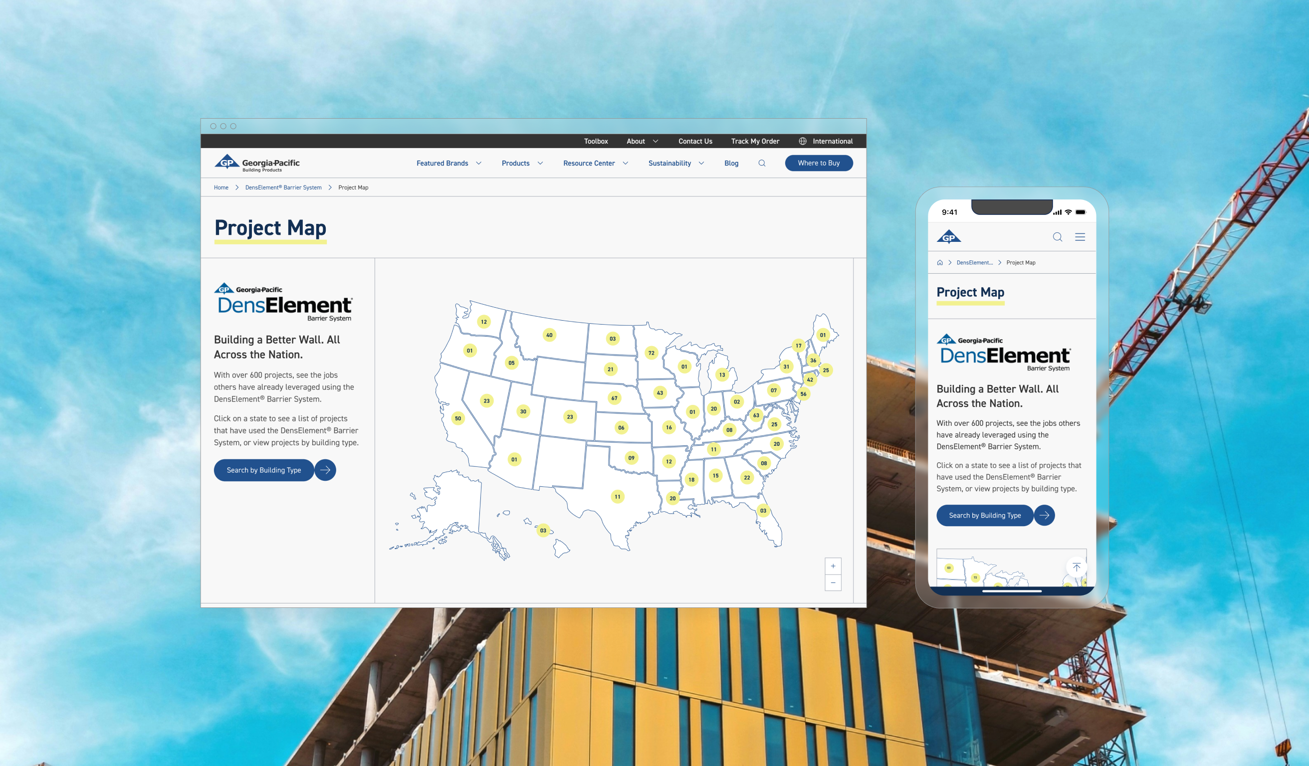
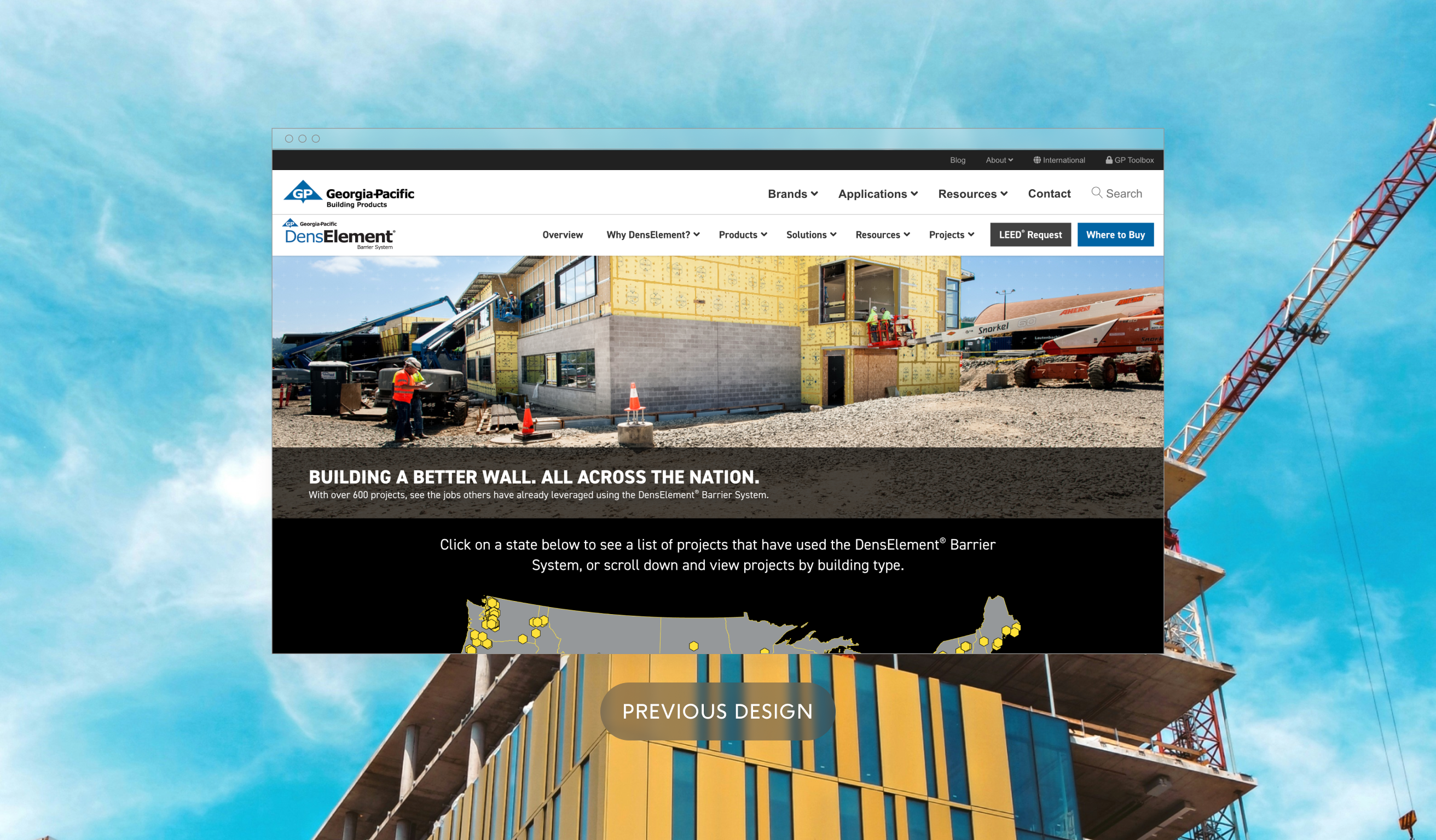
A. Content Optimization: Many pages needed layout adjustment for a better reading experience.
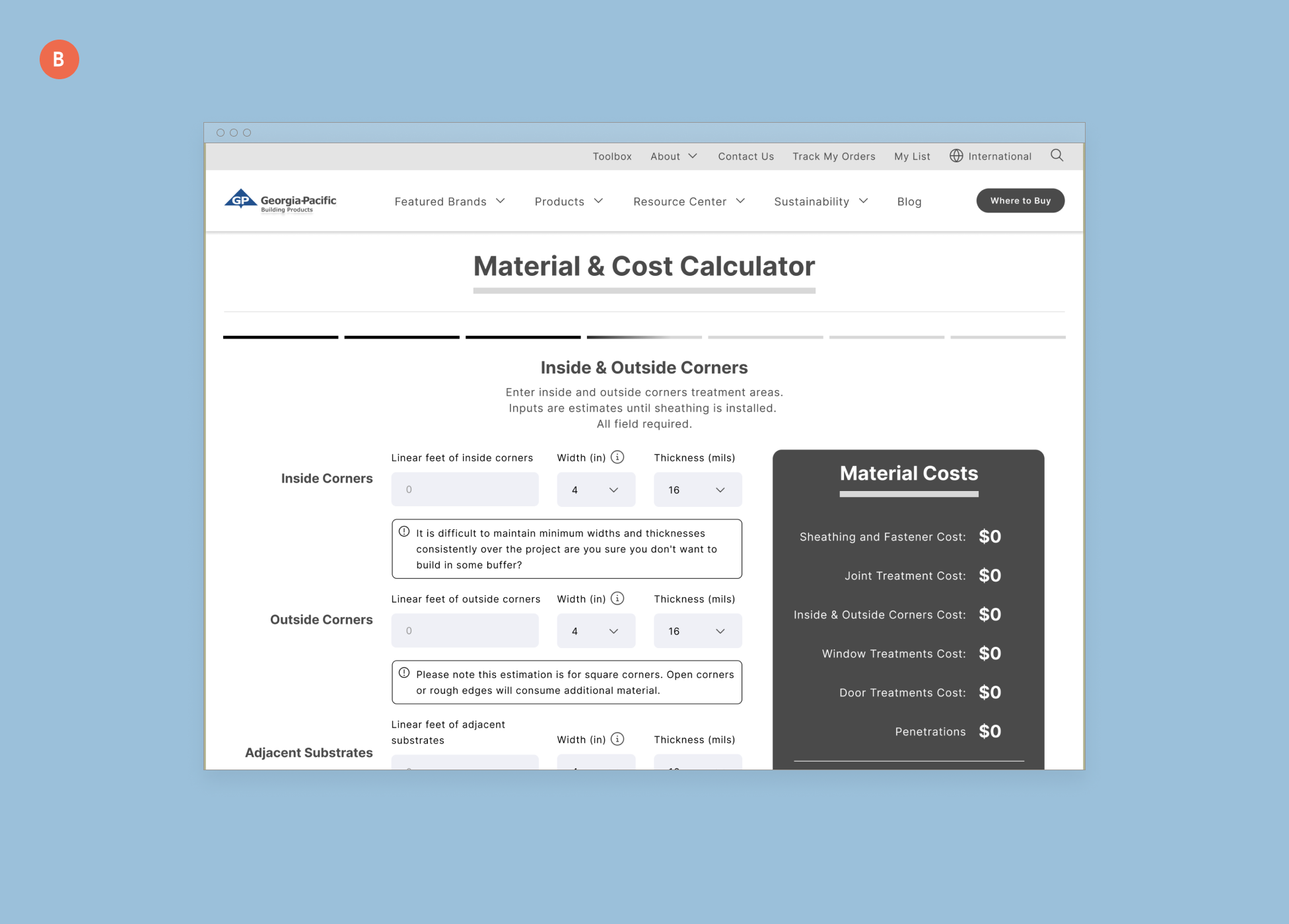
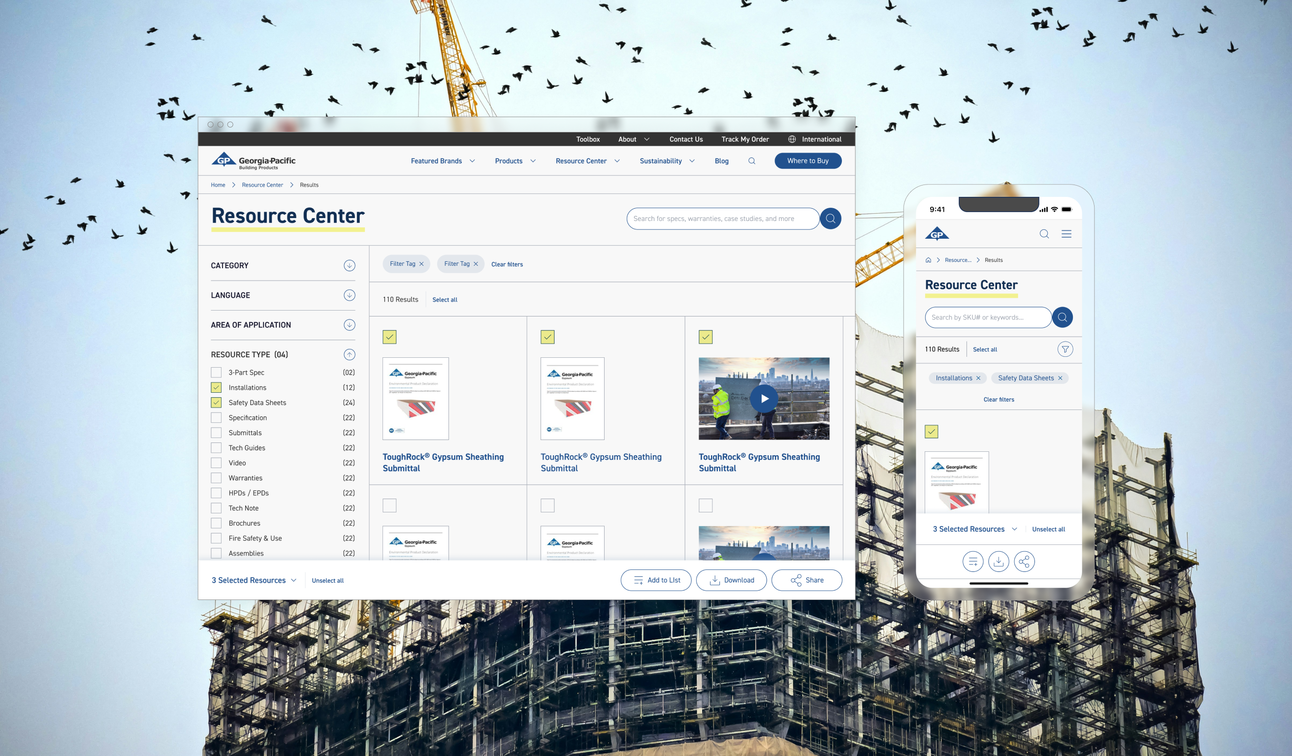
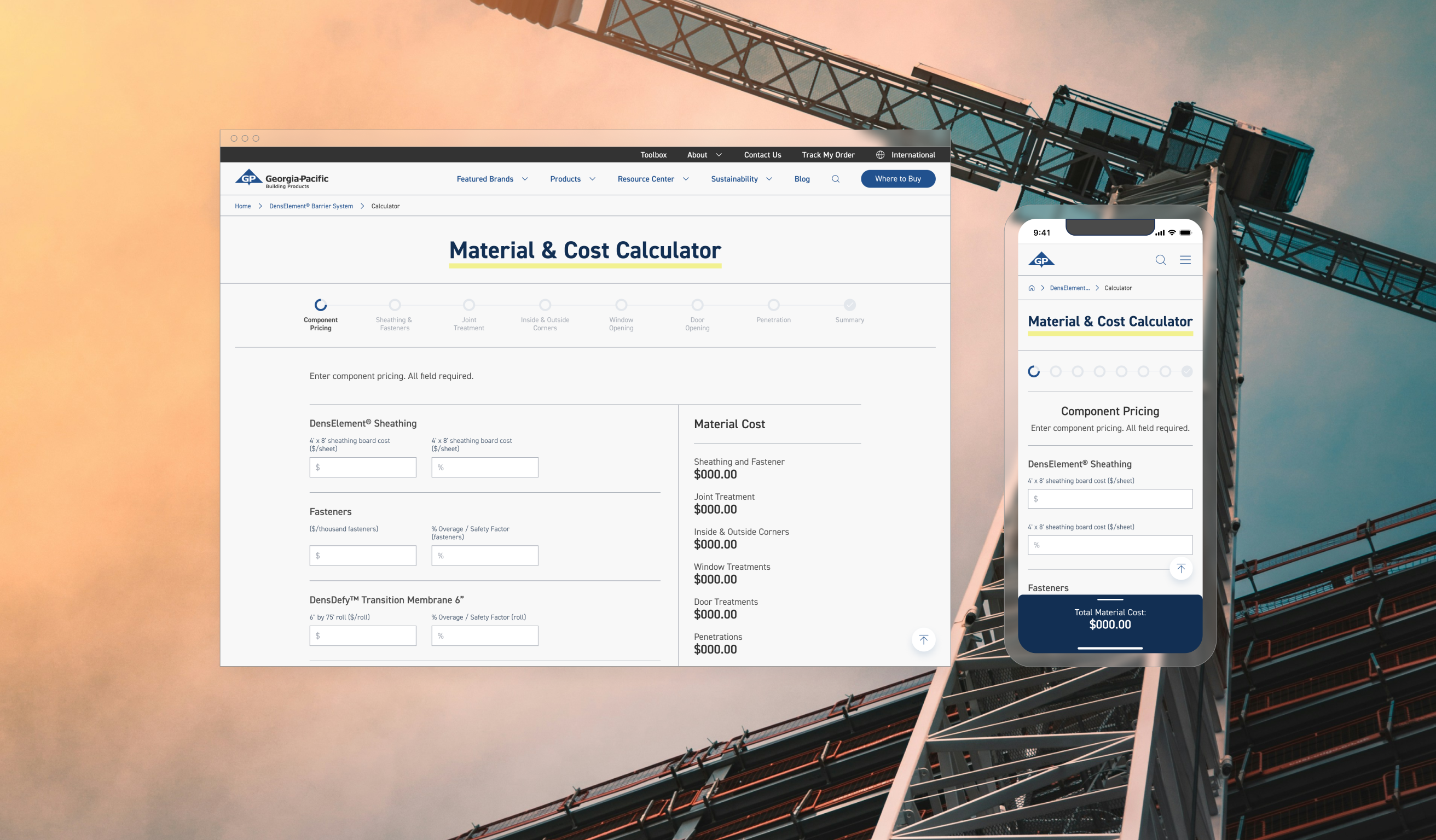
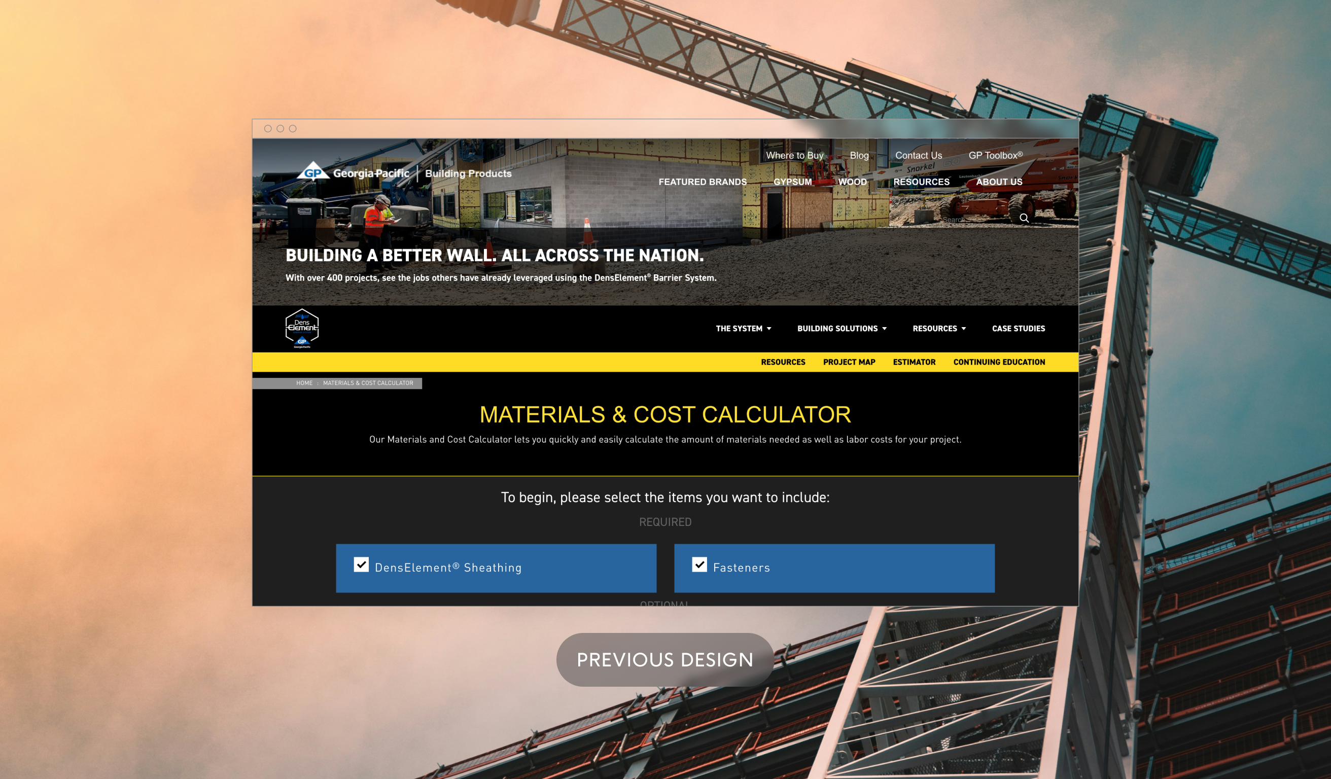
B. Added Functionality: Current tools like the Material & Cost Calculator were refined by including things like a stepper and showing the Material Cost at all times.
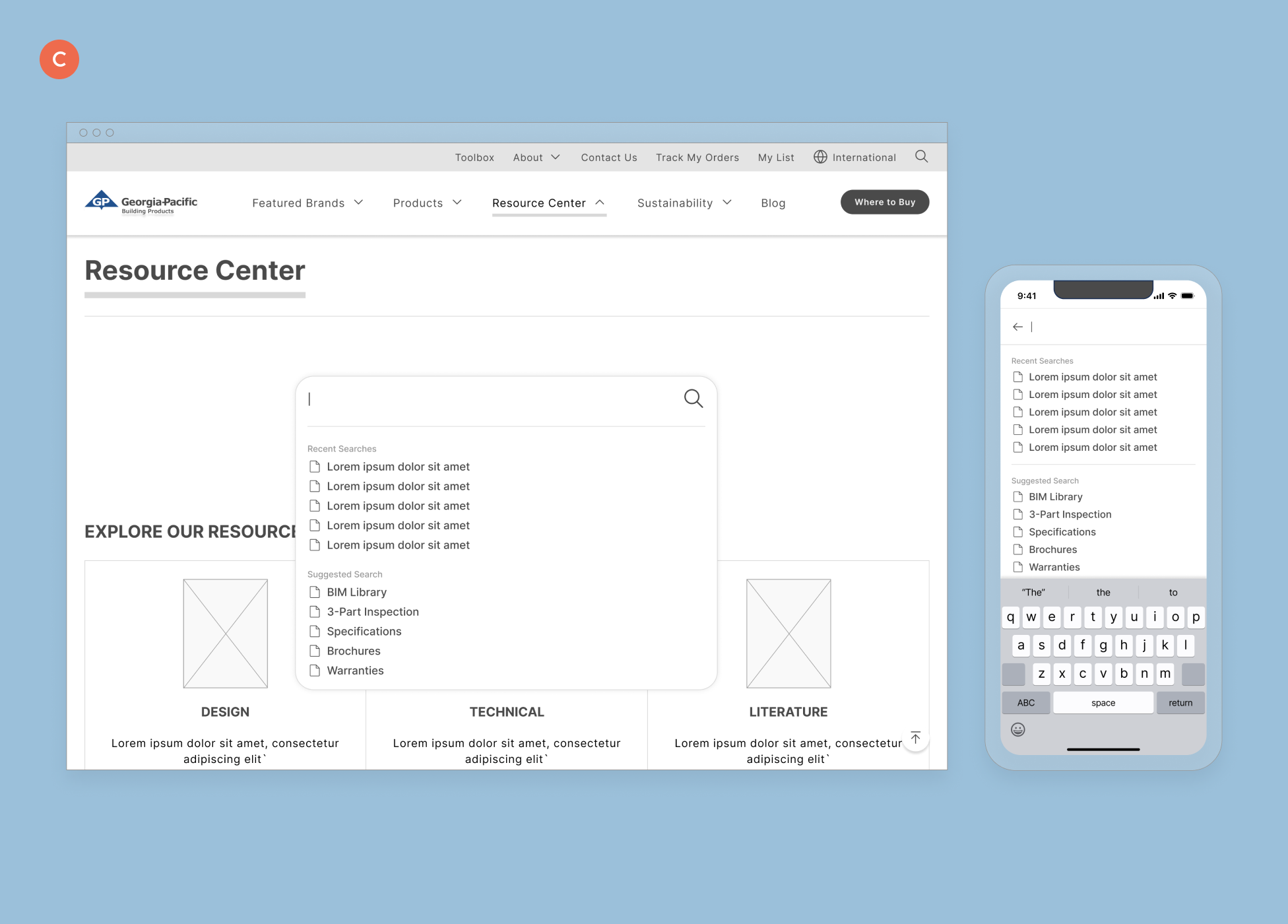
C. Optimizing Search: Search logic and functionality was added to include predictive capabilities and a more mobile friendly design.
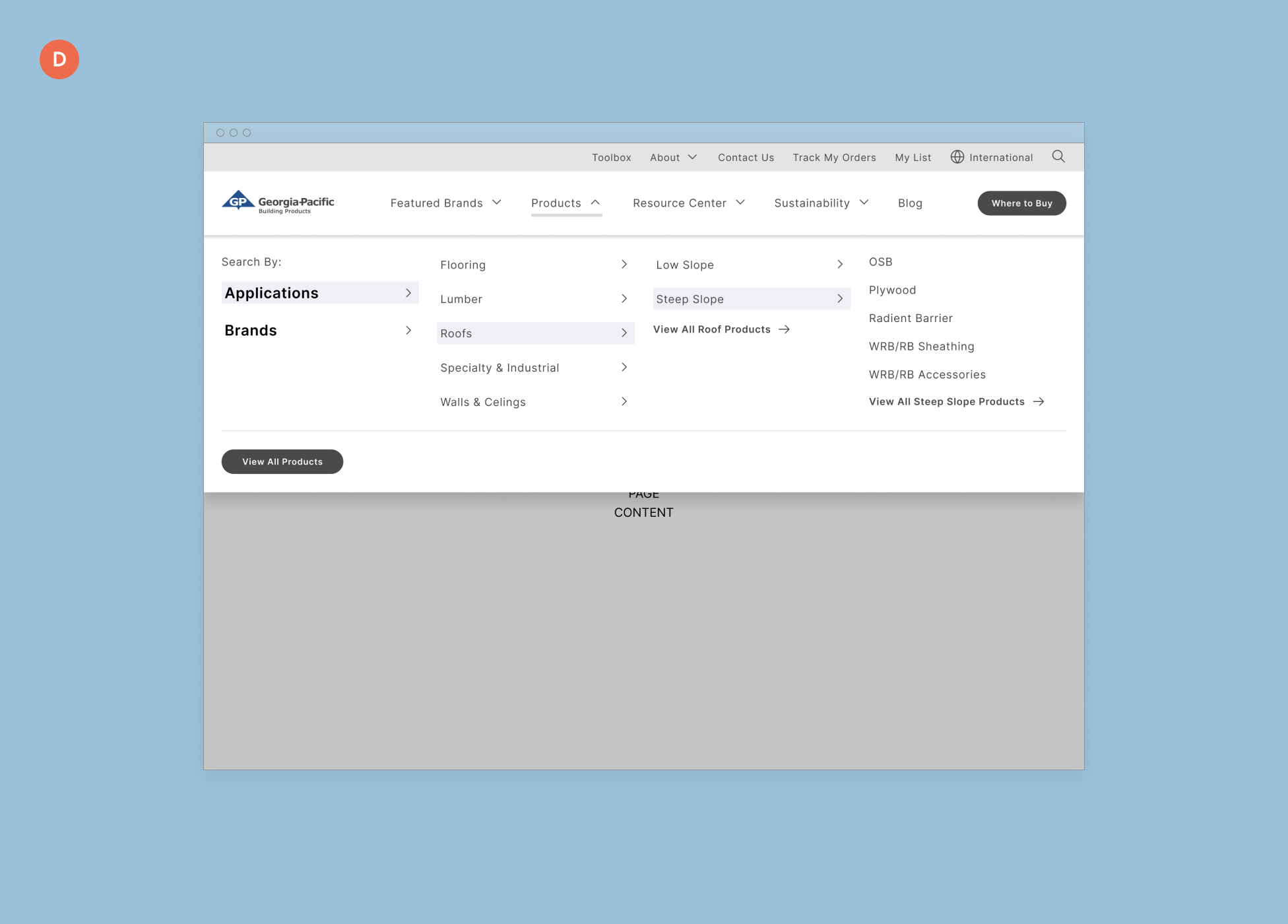
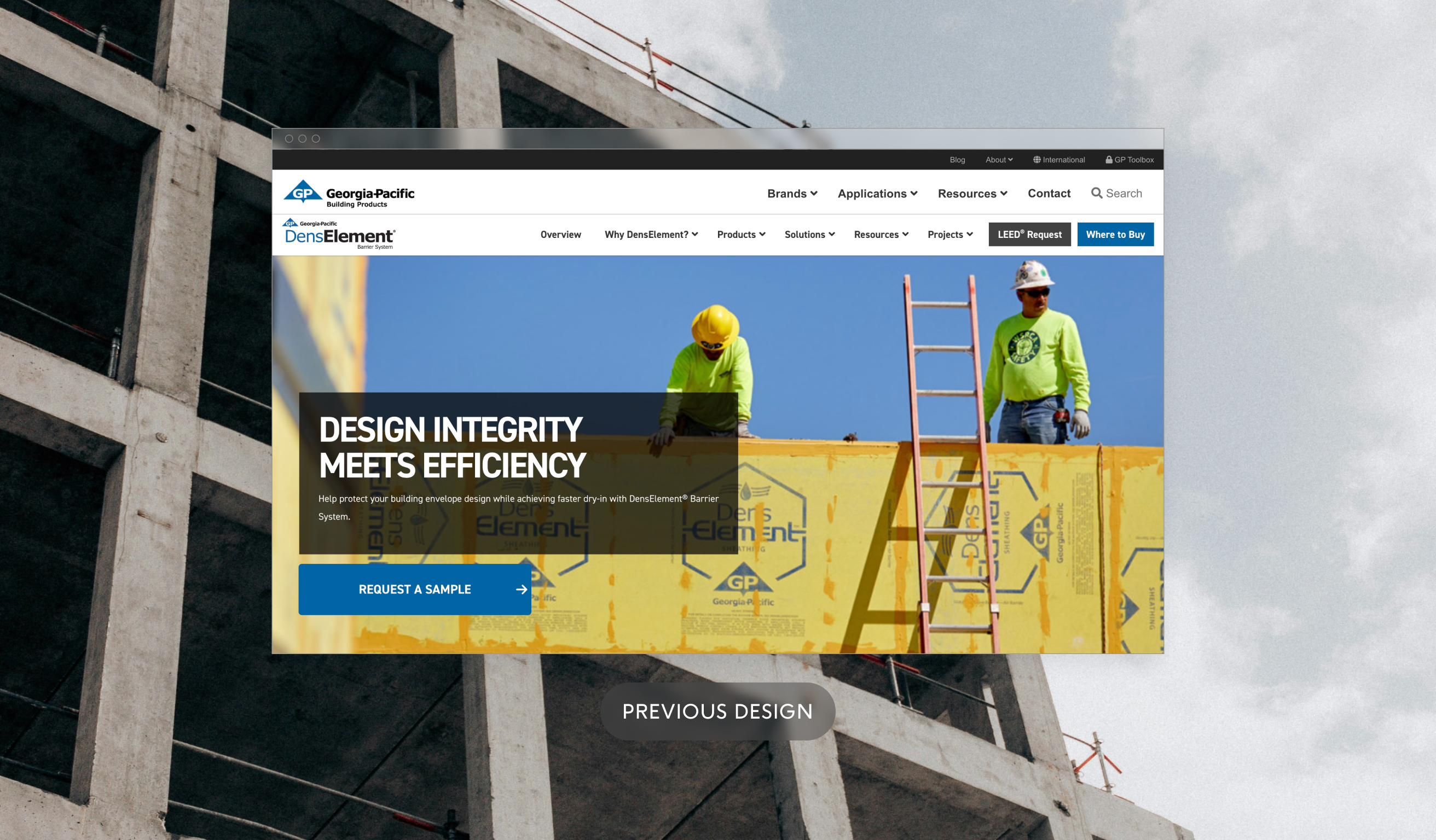
D. Condensing the Menu: The main navigation was reorganized to be more scannable.
E. Templatizing: To facilitate development, many pages were designed to share the same template.
Visual Design
Creating a new look and feel for GP Build that resonates with the brand.
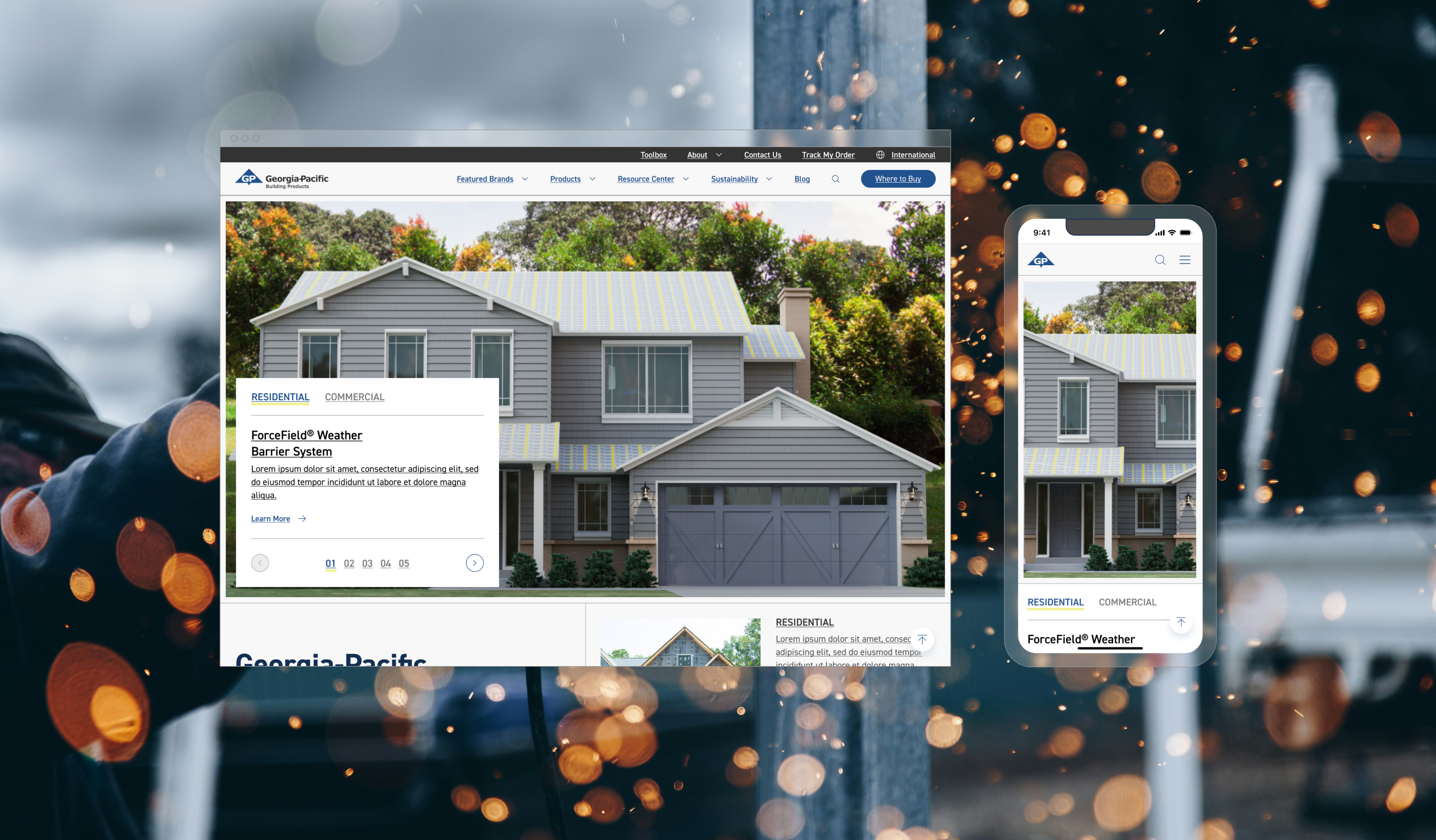
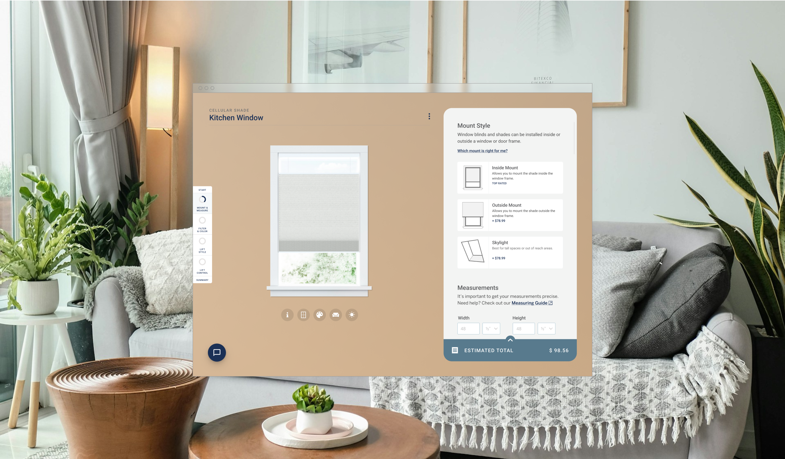
The new design pays homage to the building blueprint and precise measurement of the building and construction world. Invisible lines that separate sections and content on a page are instead a key piece of the design. The line work allows each page to be as distinctive as we want them to be. Other visual notes include the introduction of yellow used sparingly on the page. The distinctive color derives from GP Build’s products.
A New Visual Language
Using a consistent set of visual elements in a discernible pattern creates a visual langue the team can reuse and apply to new pages.
Optimizing Space
Balancing between efficient use of space and allowing each element to stand on its own, we created a set of rules on spacing that allows content to fill up the space yet not make it feel congested.
Organizing Content
Using interactive elements such as an in-line menu enables users to efficiently navigate through long-form pages, accessing content more swiftly and breaking it down into easily digestible sections.
Redesign Existing Tools
Giving existing tools not just a makeover, but also evaluating the layout for optimal ease of use and adding features where needed, like a stepper and progress indicator.
Simplify
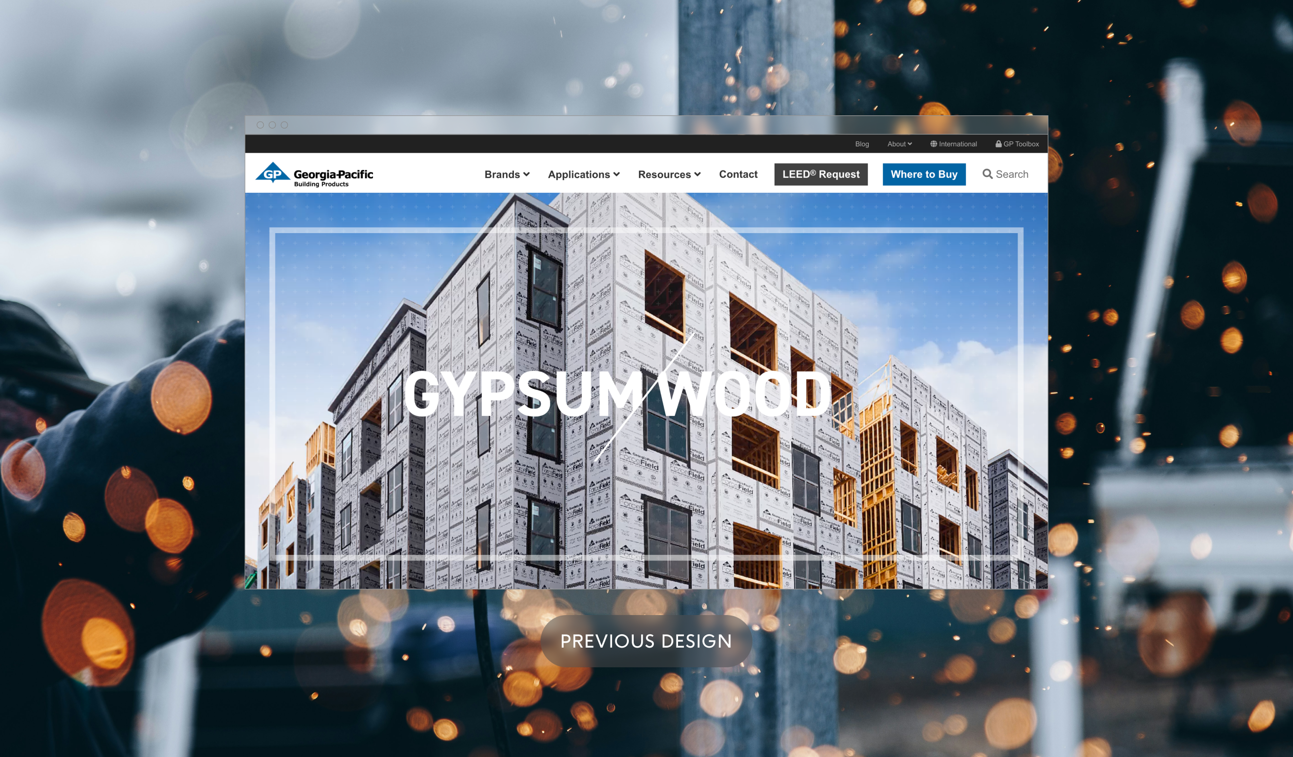
In other instances, the new design holds much of the same content, but the page design is more streamlined and simplified, allowing the content to take focus.
Learnings
This project taught me how to collaborate on a large scale. I worked closely with my team at Ammunition and also had to coordinate with Deloitte's team, keeping track of their schedule and progress.
Figma was a great asset for this project, not only because of how easy it is to jump between files and work together in real-time, but also because it was a great tool to build out the design system. Using the atomic system to build out the components allows us to make updates to the parts as well as the whole, creating a cascade of changes that update across the site in one fell swoop.
View my other projects
© Locness Designs. All rights reserved.