Gas South
Make signing up for gas a frictionless experience for everyone.
Gas South, a major gas service provider in the Southeast, needed to update its online enrollment flow to be more user-friendly. Their customer base ranges from young college students to seniors, who require their utility setup to be quick and easy to understand. However, their current enrollment flow has not been updated in a long time, lacking both in design and functionalities that many users have come to expect.
I really enjoyed working on something that can have such a huge impact on users' lives. Signing up for gas is a milestone in every independent person’s life. I took this task to heart and wanted to create a user flow that was seamless, informative, and easy to use. I particularly enjoyed being involved in the entire project lifecycle, collecting data during the research phase, exploring solutions based on our findings, and ultimately designing the solution.
RESPONSIBILITIES
Competitive Analysis
UX Design
UX Rearch
Visual Design
Stake Holder Interviews
User Interviews
User Flow Testing
TEAM
Steve Bolton - UX Director
Heidi Williams - Sr Visual Designer
Beth Haggerty - Project Manager
DELIVERABLES
Competitive Analysis
Stakeholder Interviews Report
User Flow Testing Results
Annotated Wireframes
Desktop & Mobile Designs
Style Guide Updates
TIME
Late 2020 - Early 2021
Pain Points
Before finding a solution, I needed to understand Gas South’s business and their challenges.
In our stakeholder interviews, I aimed to uncover how each business unit operates, their day-to-day challenges, and their involvement in the enrollment flow. Understanding how the online enrollment process impacts their responsibilities and identifying potential improvements to enhance their experience will benefit everyone. It contributes to the smoother operation of the business and in turn better care for the customers.
Understanding the struggles.
OPERATION
Enrollment flow data is not real-time.
Lack a true API with AGL (Atlanta Gas Light).*
IT
The enrollment site is not responsive which also hurts their Google ranking.
SUPPORT AGENTS
Lack of a real-time status indicator led to a many support calls about the application's status.
BUSINESS TEAM
How to make use of the waiting time before service start?
* Everyone remarked the same pain point. AGL is the company that turns on the gas service and is not affiliated with Gas South.
What does success look like?
OPERATION
Smooth and seamless customer journey. The experience itself shouldn’t be a cause to lose the sale.
IT
Make things under-the-covers work more efficiently.
SUPPORT AGENTS
Going through the enrollment flow without needing to contact support at all.
BUSINESS TEAM
Customers feel there is transparency and feel informed about their options.
Solutions Exploration
Taking what I heard from stakeholders as seeds of inspiration.
No one knows a product better than those who maintain and work with it every day. Their invaluable insights allowed me to formulate various ideas and approaches for improving the enrollment flow. It was particularly enlightening to discover that their small to medium-sized business customers had been unable to use the enrollment flow all this time. Integrating them into the flow posed a challenge, but I was happy to take it on.
AREAS OF FOCUS
A. Contextual Information: Integrating the plan details into the plan cards and a detail modal for additional content.
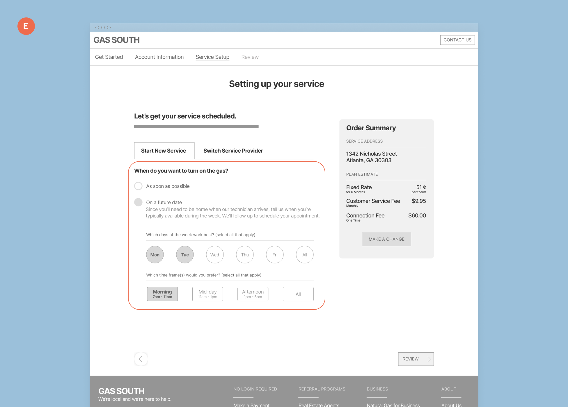
B. Status Indicator: Maximized the time waiting for service by create a status page where GS can promote other services/partners.
C. Commercial Customers: Allowing these customers to use the same enrollment flow vs an entirely different one.
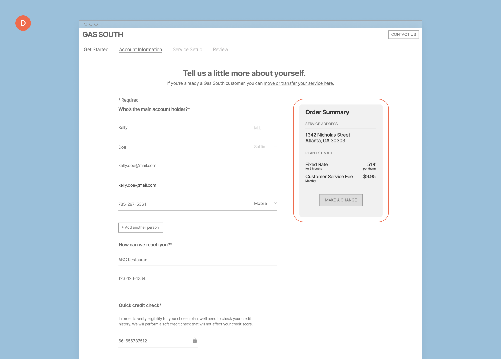
D. Transparency: Clearly state all cost and fees associated with a plan.
E. Language: Finding the right words to explain tricky situations like the service date is only an estimate due to AGL dependency.
We conducted user interviews on past, current, and non Gas South customers. Walking them through two different user flows and their current flow as a control.
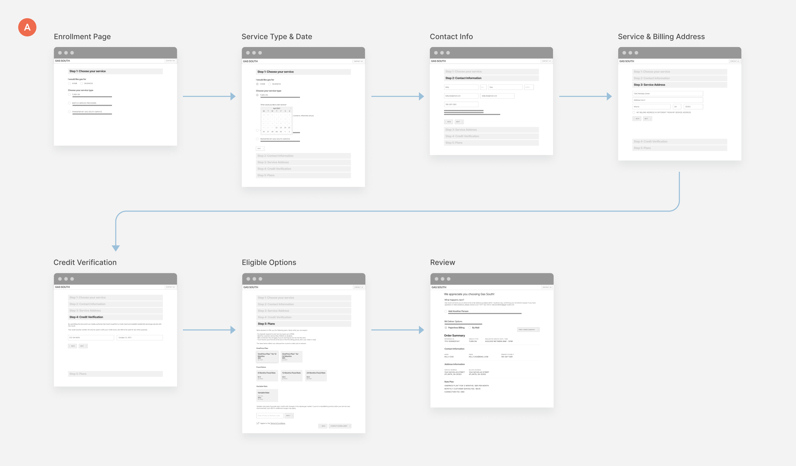
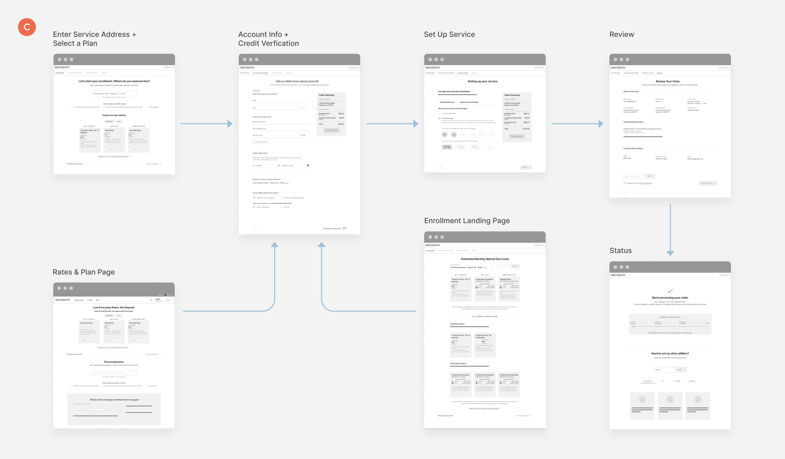
FLOW A (CONTROL)
Measuring improvement becomes challenging without something to compare it to. Therefore, we tested the current enrollment flow against others, not only as a control but also to identify features we should keep.
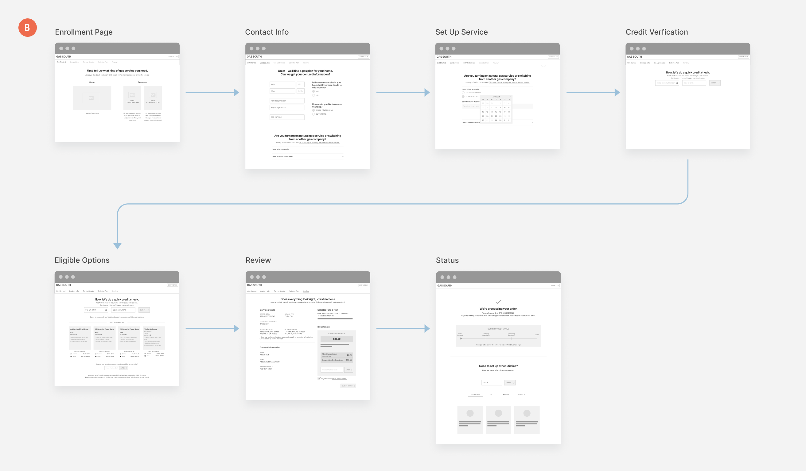
FLOW B
This flow had a completely different content model, guiding users down a single page section by section. It included more detailed information about plans and seasonal estimates to assist customers in estimating costs. At the end, it also provided a monthly bill estimate.
FLOW C
This last flow integrated Gas South’s Rates & Plans page into the enrollment flow. Knowing that about 50% of customers visit this page before entering the enrollment flow, it could be useful in educating them on price plans and estimated cost beforehand.
What Customers Wanted
A combination of all three flows.
No one flow came out on top, but all three had things customers loved. We were able to talked to customers from all age group and in different stages of their life. This was important for us because their needs and priorities are all different and something we wanted to account for in the enrollment flow. The guided approach from A, plan details and price estimates from B, and how several steps were condense into one in C were all big hits.
The user flow test gave us insights on a variety of areas of investigation. I organized each participant’s preference and tallied them together. This allowed us to see which they prefer and which they clearly did not.
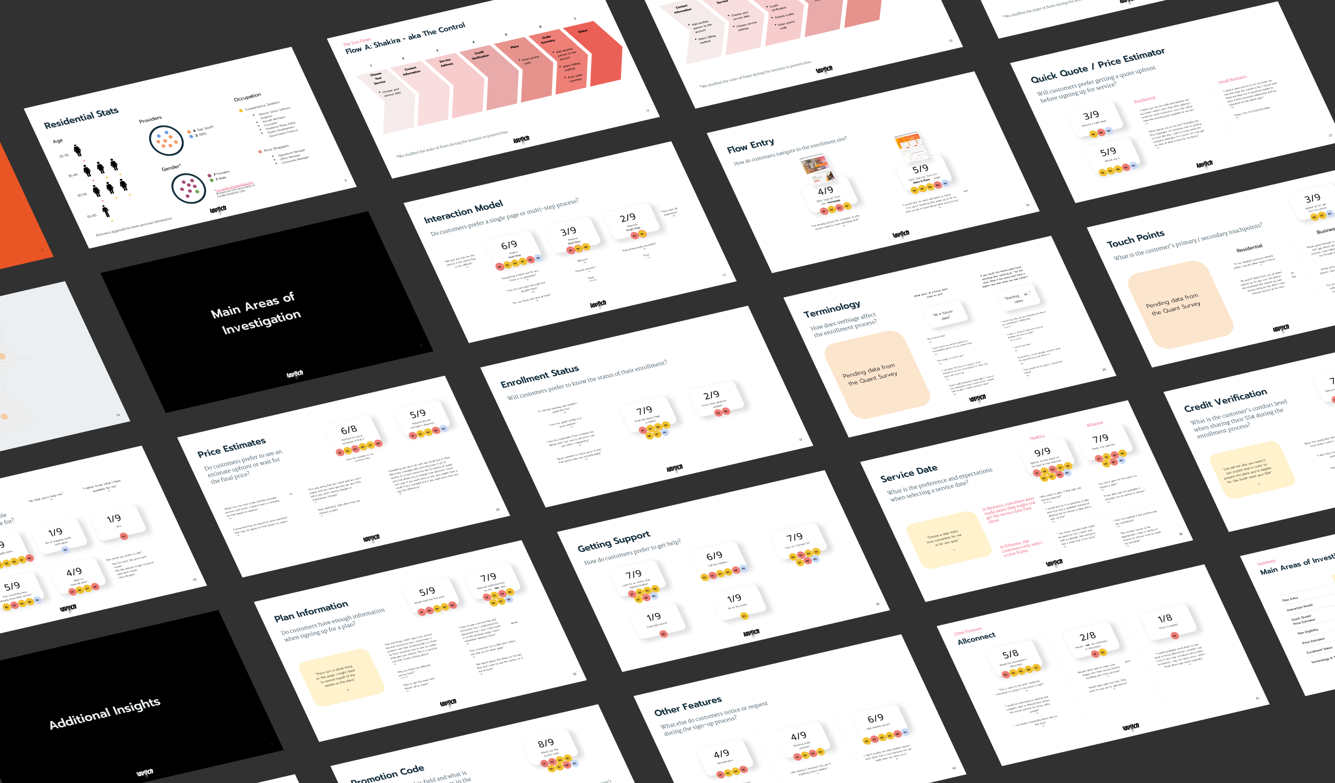
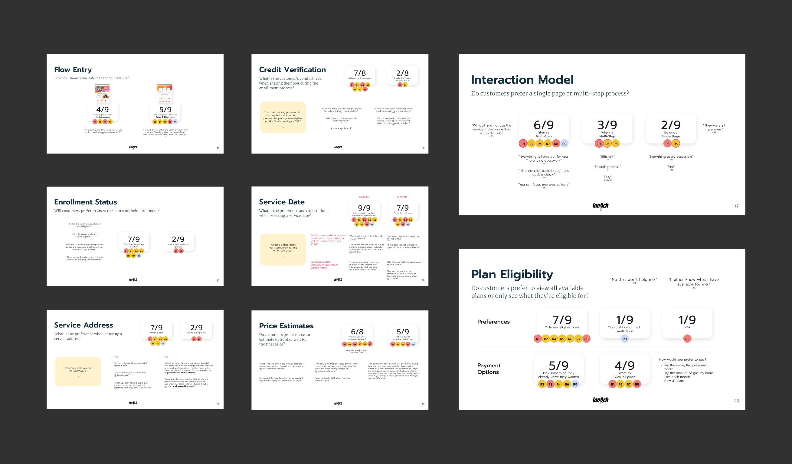
INTERACTION MODEL & NAVIGATION
The guided step-by-step approach was most helpful in enabling users to focus on one task at a time while also providing visibility into the remaining steps and the estimated time to complete them. The sooner they finish, they sooner they can get things up and running.
PLANS & PRICES
The plan details were notably absent in the current flow hence why most customers exit to check the Rates & Plans page on their website. Integrating them into the design was very helpful and well-received. The order summary feature also aided in transparency and added trust.
ELIGIBILITY
Gas service availability depends on your location, but we also examined how individuals might respond if their credit history affects their plan options. The outcome very much centered on transparency and just letting customers know what they can get vs dancing around the issue.
The New
Enrollment Flow
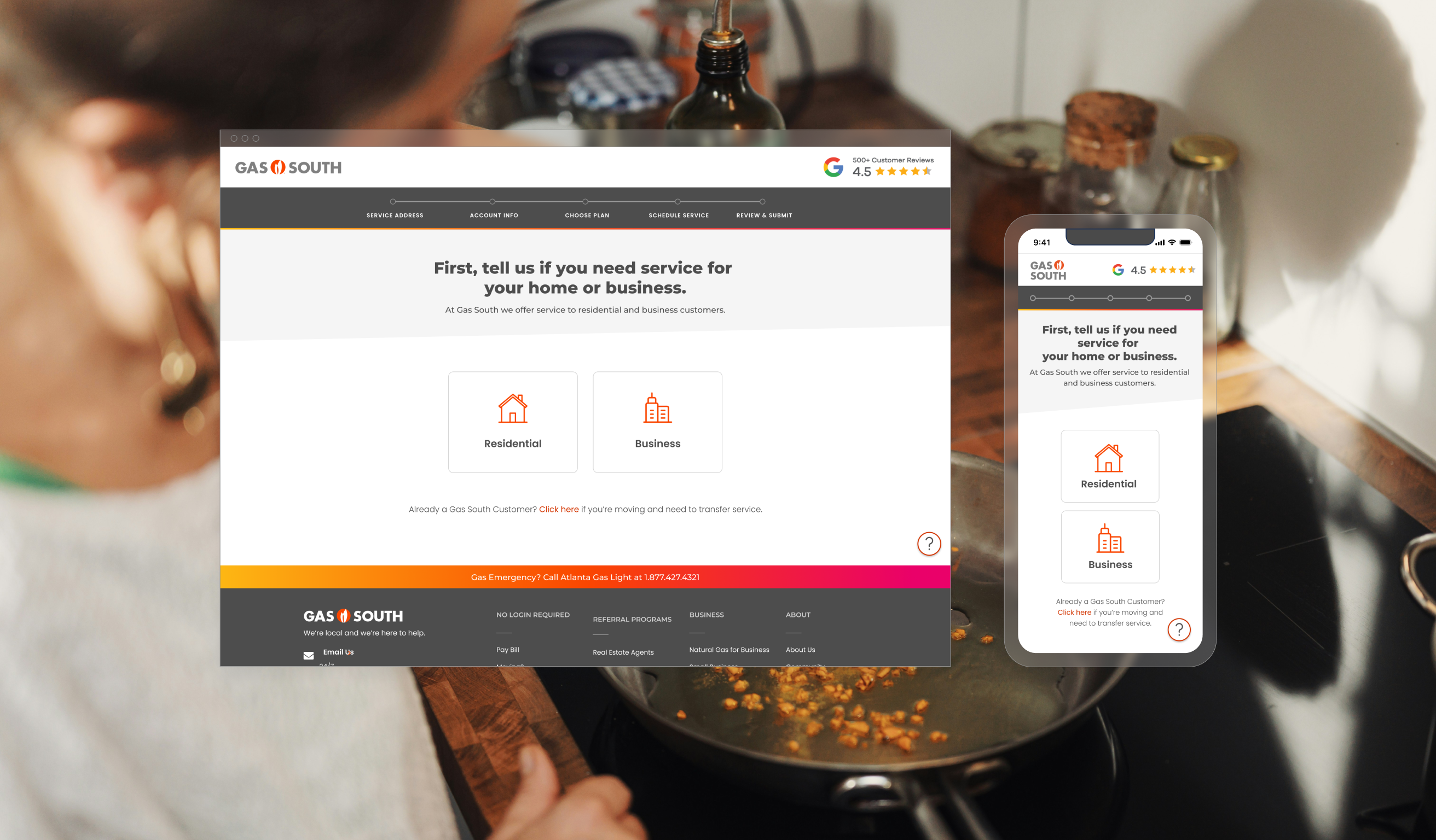
The design was kept simple and utilitarian while keeping in line with their new branding.
The visual design was overseen by our Senior Designer, focusing on usability, accessibility, and ease of use. We introduced a stepper at the top to inform customers about their past, current, and upcoming steps, with each step providing clear directions. Additionally, the Account Details panel records the current state of the application for customers to monitor.
While I served as the main UX lead on this project, I also contributed to the visual design and assisted with mobile designs. One visual challenge I addressed was integrating the Account Details on mobile devices, where space is more limited. The solution involved creating a drawer that users can access at any time and close when not needed.
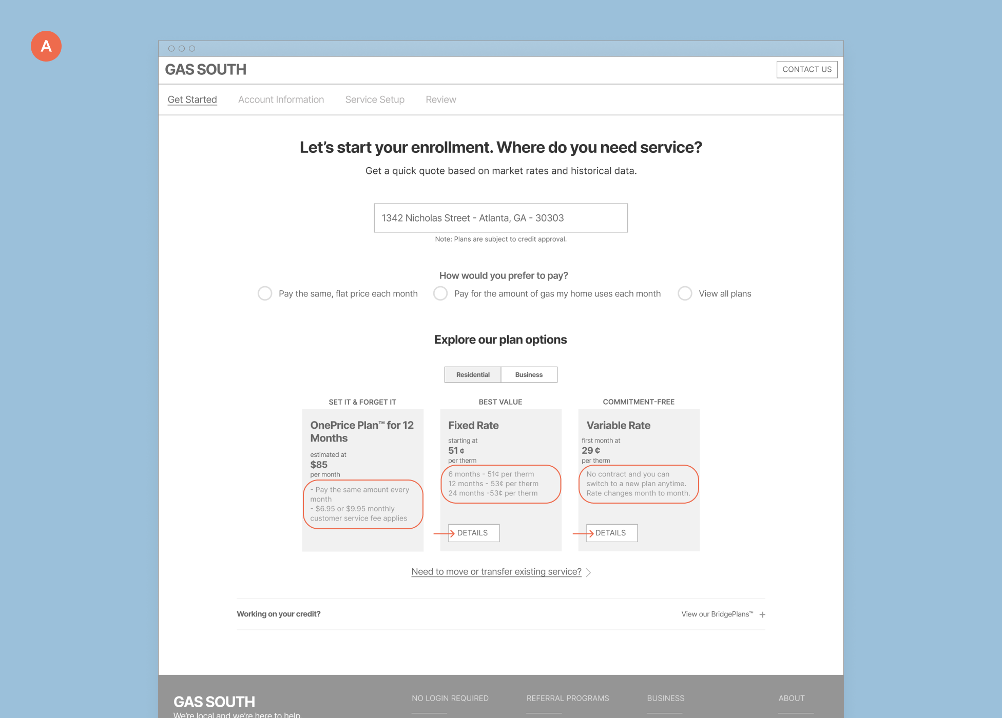
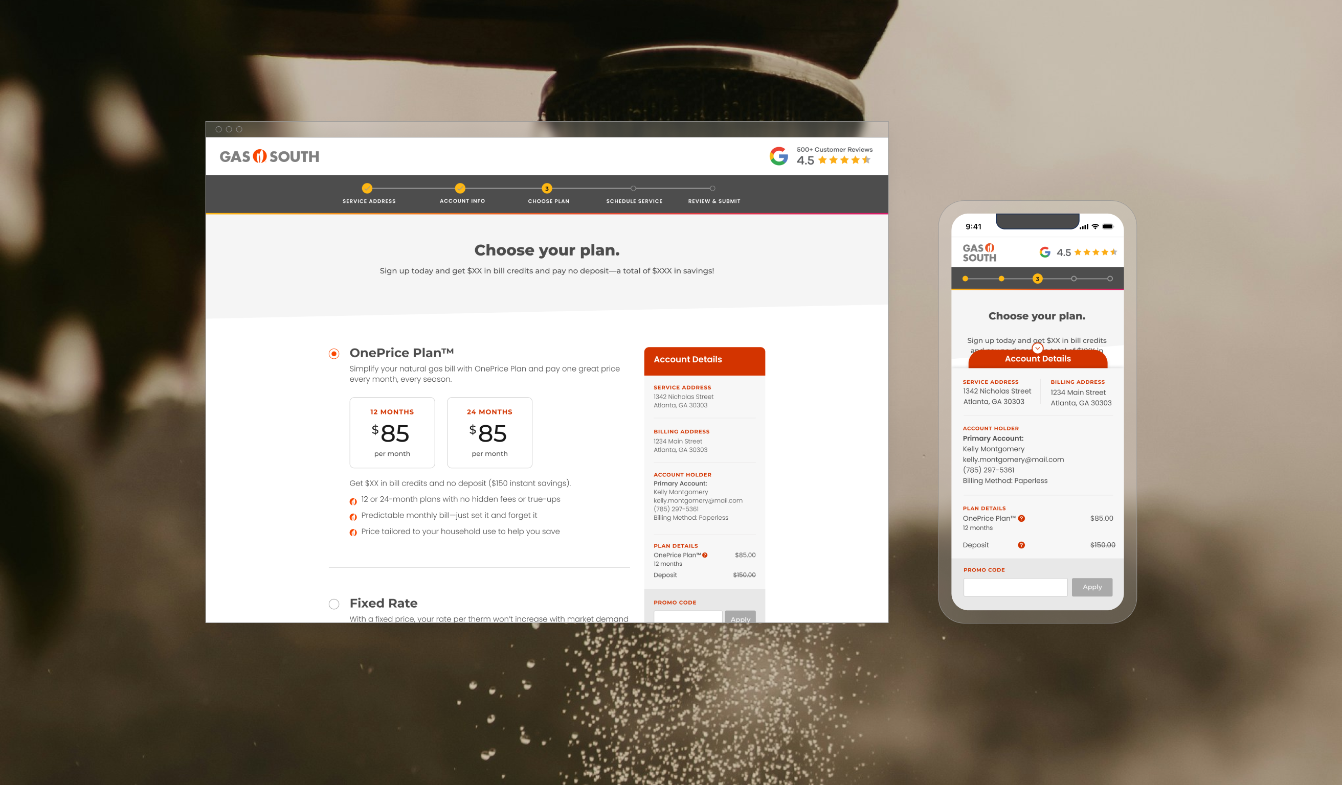
Plan Information
Added the plan details with the plan selection so customers know exactly what each plan will include.
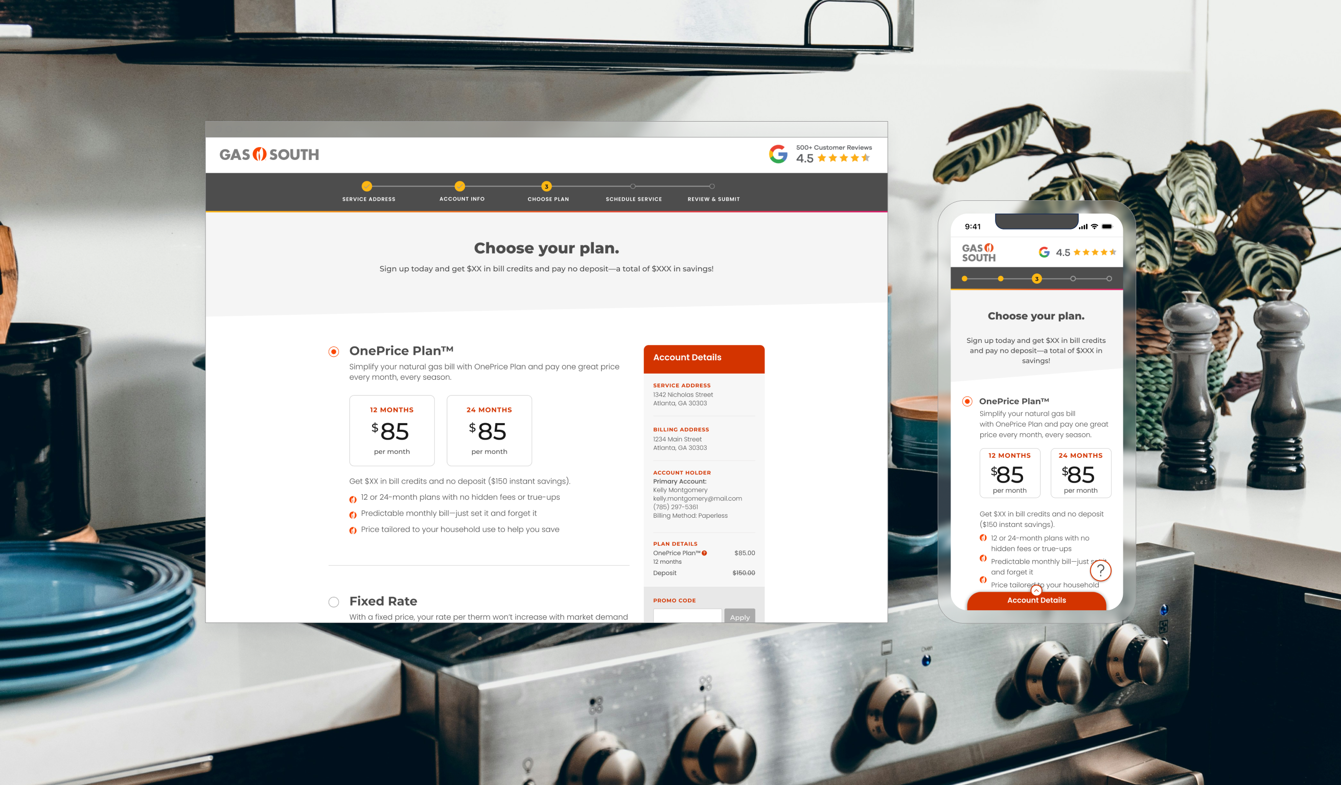
Account Details
Customers can see a running tally of the what they’ve entered and selected.
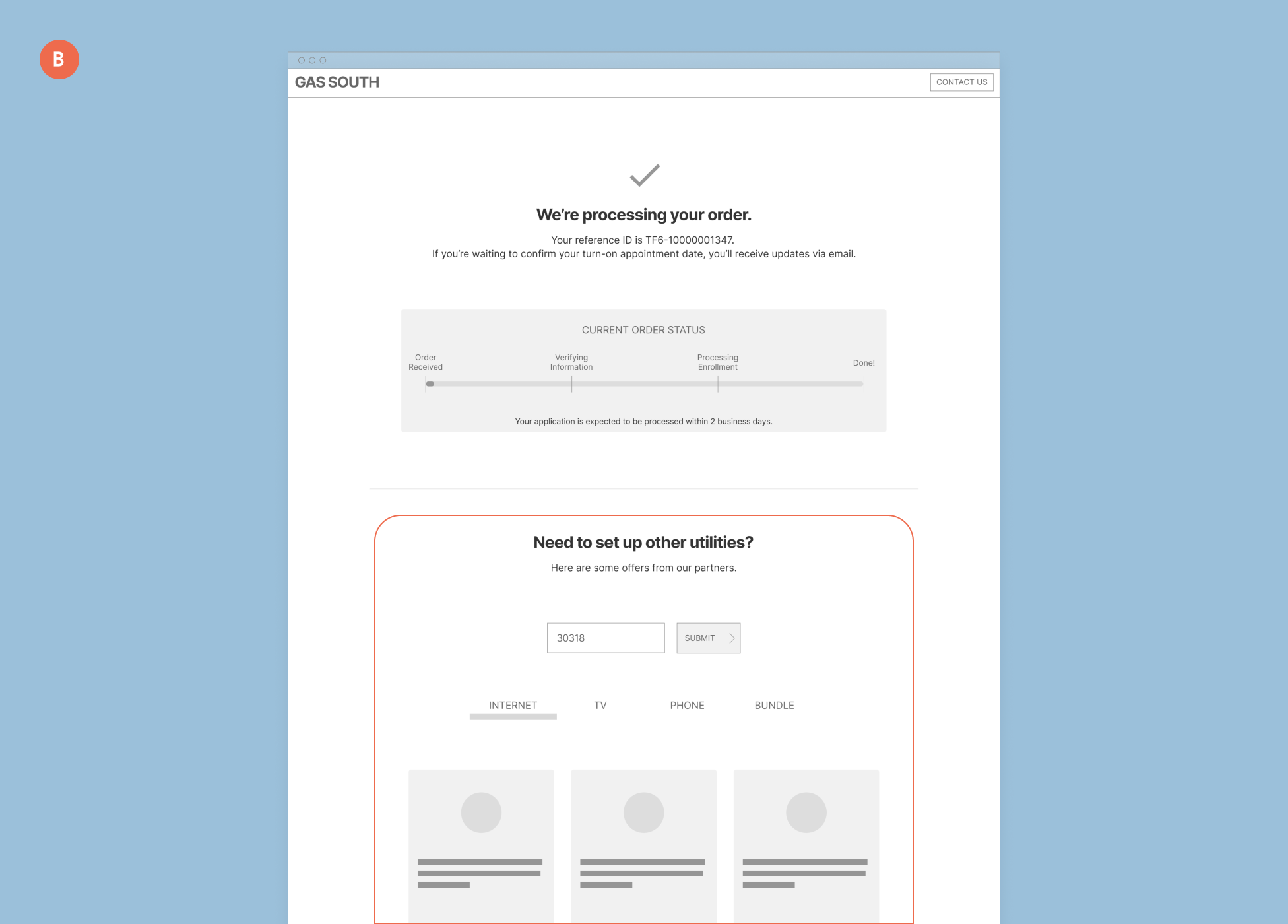
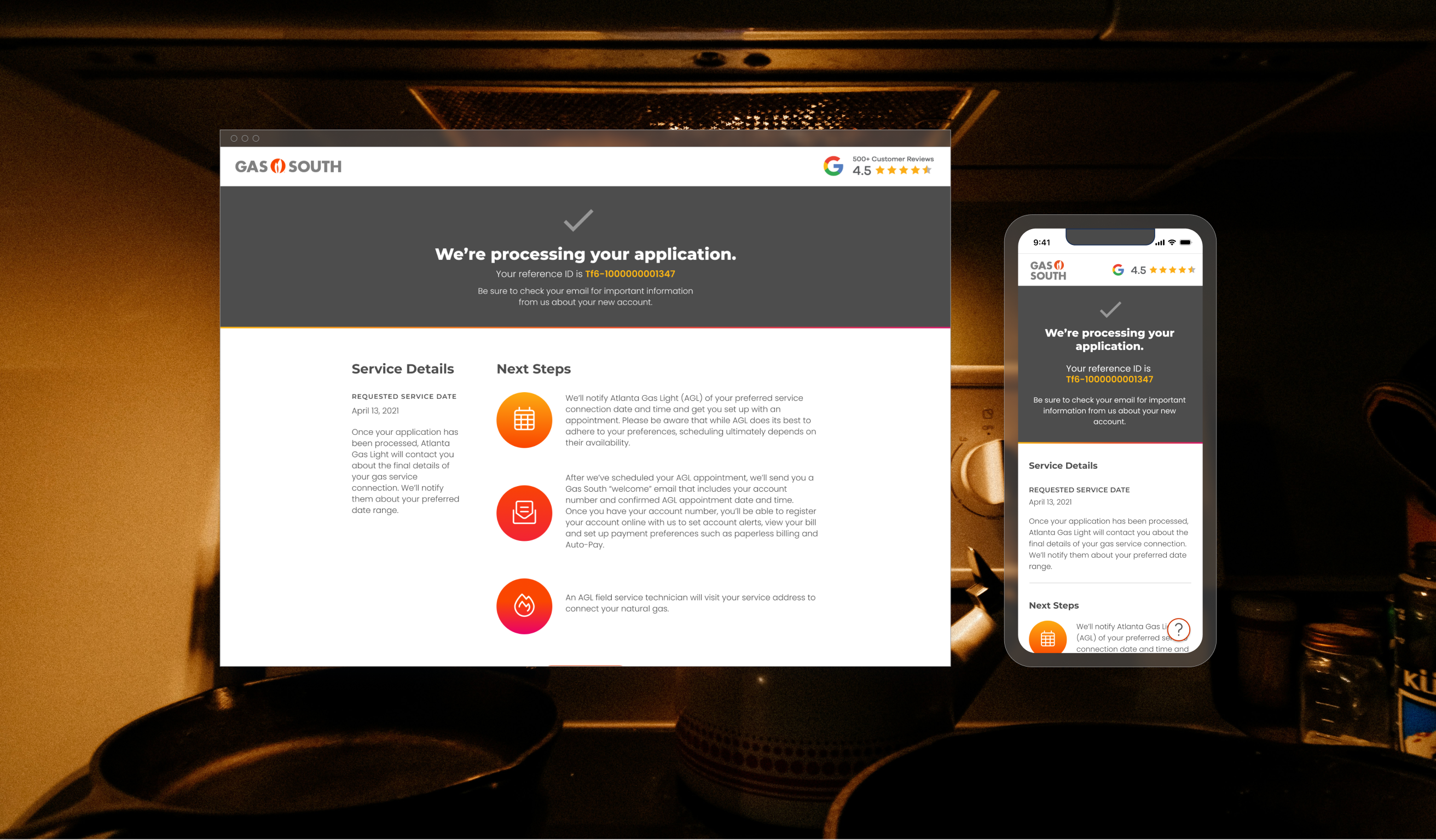
Confirmation
We introduced a confirmation page that gives customer something to reference their application with and detailed information on what to expect next.
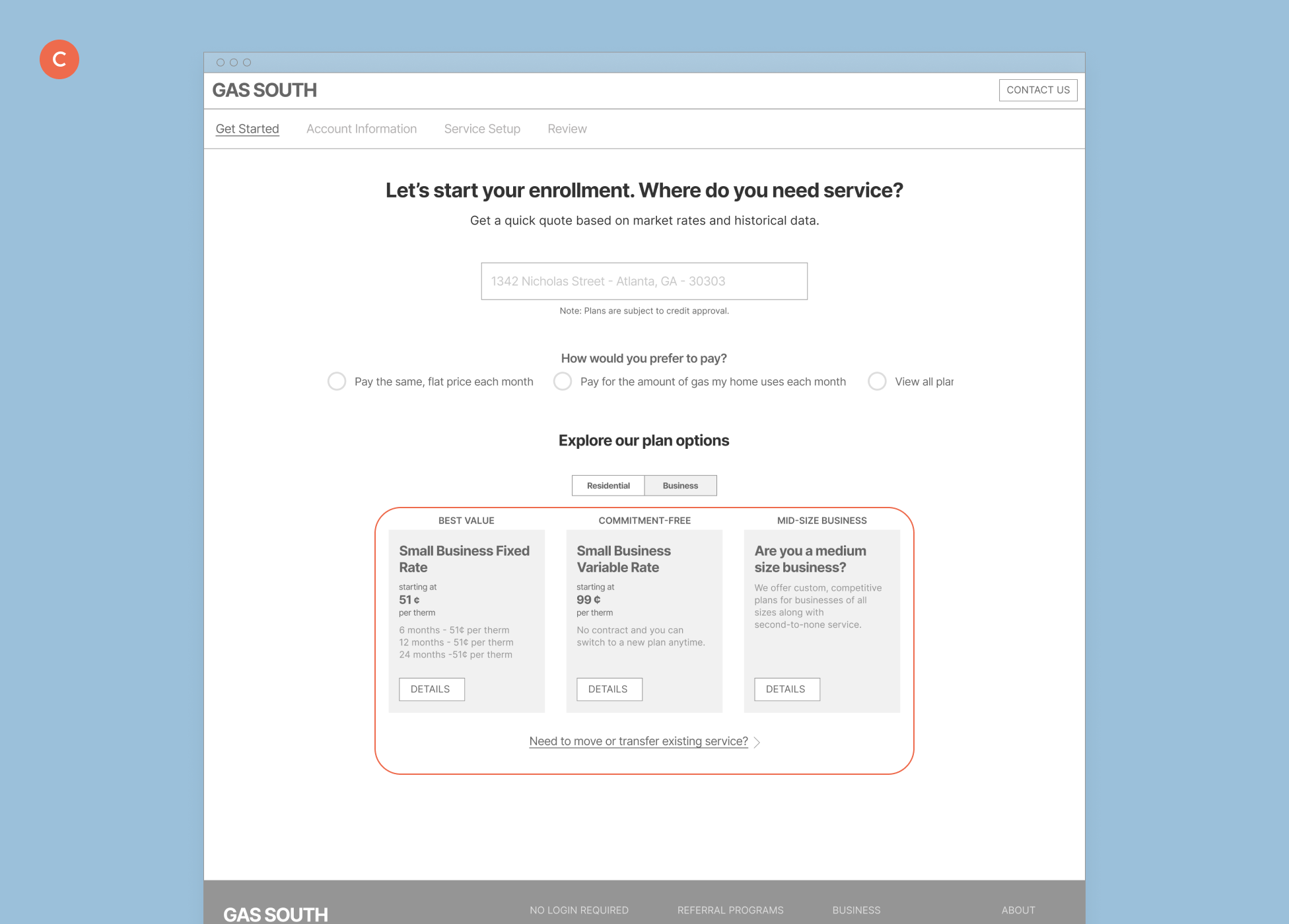
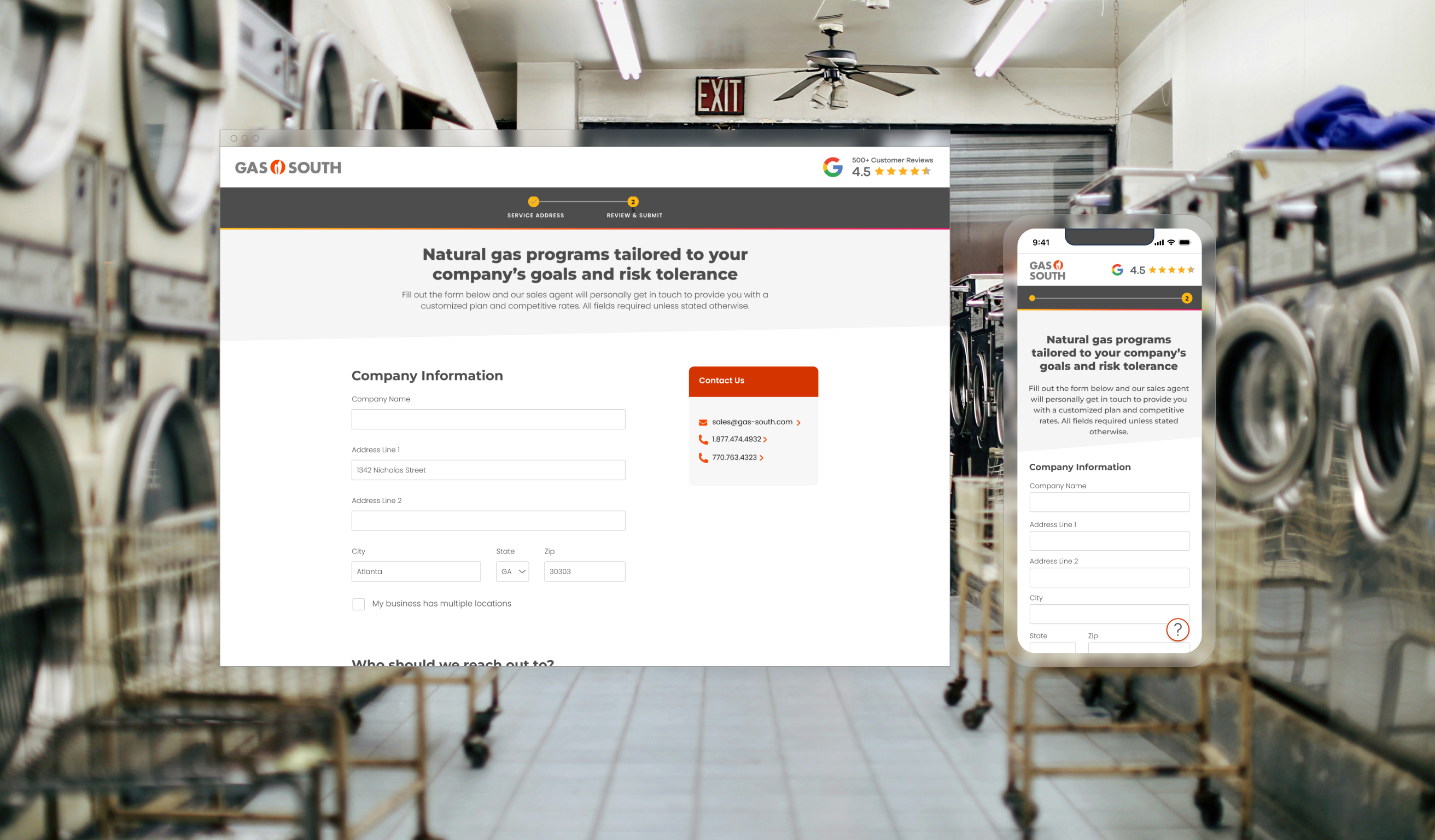
Large Business
Having the system determines if the service address relates to residential or commercial allow large business customers to get to this page automatically. This fast tracks them to talk to the sales team and allow all Gas South customers to use the enrollment flow.
Learnings
Balancing business needs and user needs were key to creating a viable solution here.
Having the opportunity to speak with key stakeholders at the beginning of the project was instrumental in understanding Gas South's challenges and their efforts to address them. UX and design truly shine for me when they can positively impact someone's life, and this project benefited both the business and the users.
I enjoyed learning about a business that’s a part of so many people’s lives. I learned a lot about the Research phase of UX on this project and also strategies on how to organize the insights you get from so many conversations. Tracking and noting them were key to showing Gas South which idea stands out and guided us down a solution that truly serves Gas South’s customers and the business.
View my other projects
© Locness Designs. All rights reserved.