Research-informed designs
Gas South, a major natural gas provider in the Southeast, faced a significant problem: their online enrollment flow was outdated both visually and functionally. It wasn't mobile-friendly, had a low sign-up rate, and a high drop-off rate. The team didn't just want a redesign; they wanted a research-driven redesign that solves for the gaps. I led the research efforts that included looking at their competitors, talking to stakeholders, and developing various solutions and user flows. I then conducted user testing to determine the most effective approach. As a result, the updated enrollment flow is more efficient, created less confusion, and got Gas South more customers.
MY RESPONSIBILITIES
Competitive Analysis
UX Design
Visual Design
Stake Holder Interviews
User Interviews
User Flow Testing
TEAM
Steve Bolton - UX Director
Heidi Williams - Sr Visual Designer
Beth Haggerty - Project Manager
Challenges the Gas South’s team were facing
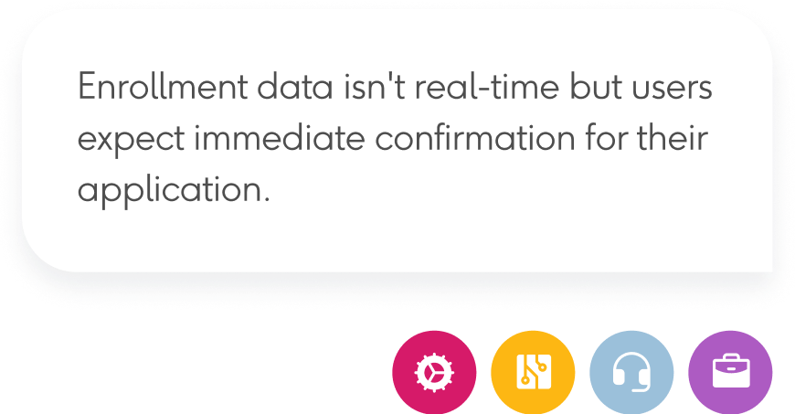
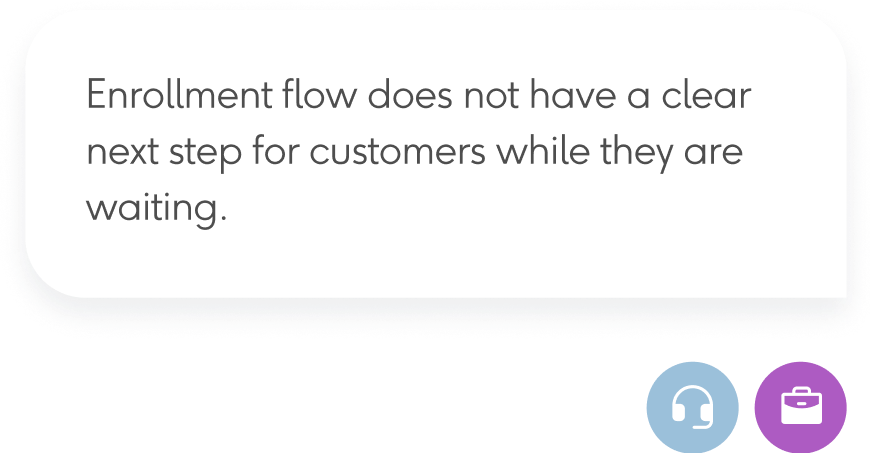
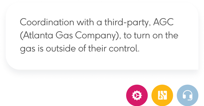
In talking to the four main teams involved in the enrollment process, it became clear that they all share more challenges than they realized.

OPERATIONS

IT

AGENTS

BUSINESS
Gleaming insights by asking customers directly
Not just to see what works and what doesn’t work, talking to the customers directly provided many nuanced insights that informed the final design.
PRICE SHOPPER
LIKES TO SHOP AROUND BEFORE COMMITTING
CONVENIENCE SEEKER
PREFER THE OPTION WITH THE LEAST OBSTACLE
SMALL BUSINESS
SPEND LESS THAN $1,500 / MONTH ON NATURAL GAS
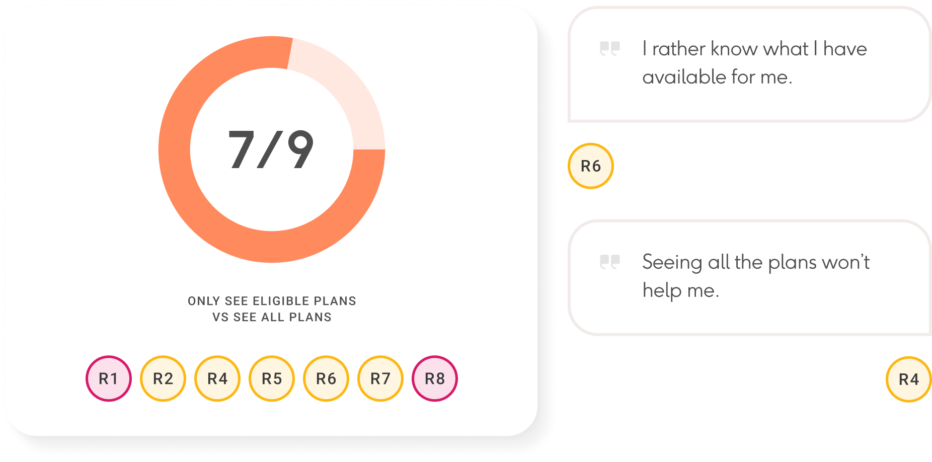
PLAN ELIGIBILITY
INSIGHT
Gas South wanted customers to see all available plans, but our testing showed users prefer to view only the plans they qualify for. This led us to prioritize ways to do just that.
SERVICE DATE
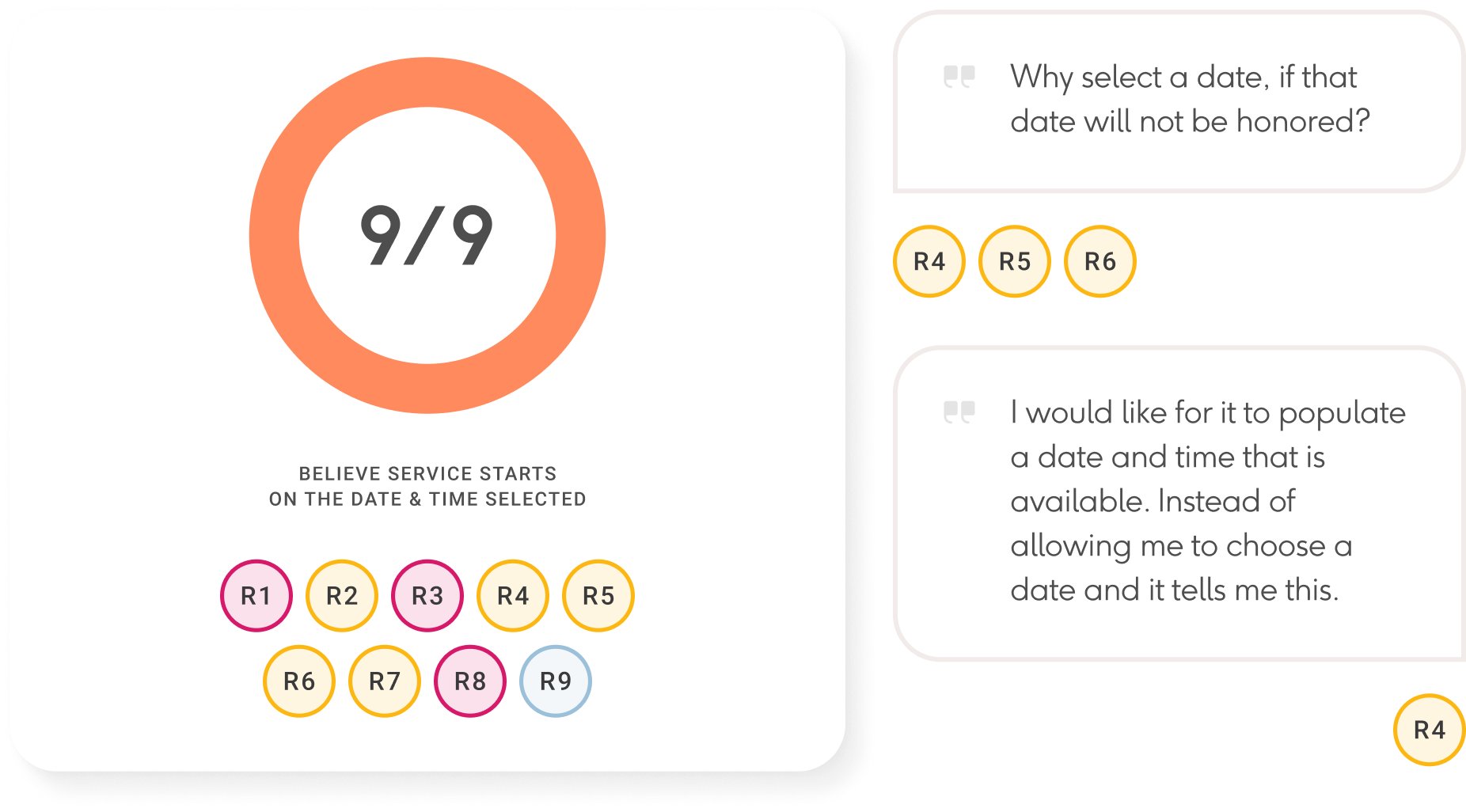
INSIGHT
Gas South cannot confirm the exact service date, as AGC is responsible for it, but customers expect the date they chose. We needed to find a clear way to communicate this limitation to customers.
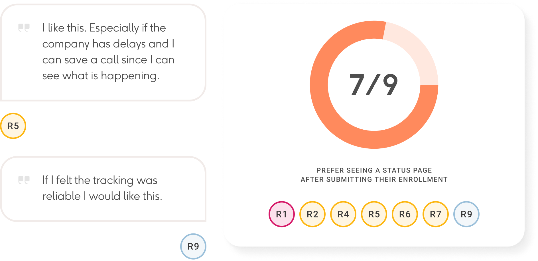
ENROLLMENT STATUS
INSIGHT
Designing a status page can alleviate customer stress by providing updates on their enrollment application and guiding them through the next steps.
Putting the research to use
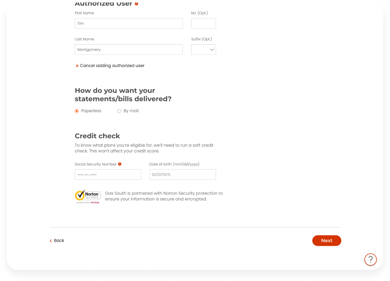
The new user flow is a multi-step process that allows customers to see upcoming steps and return to previous ones. More importantly, the steps are in an order to help users find a plan and rate they are eligible for.
PLAN ELIGIBILITY
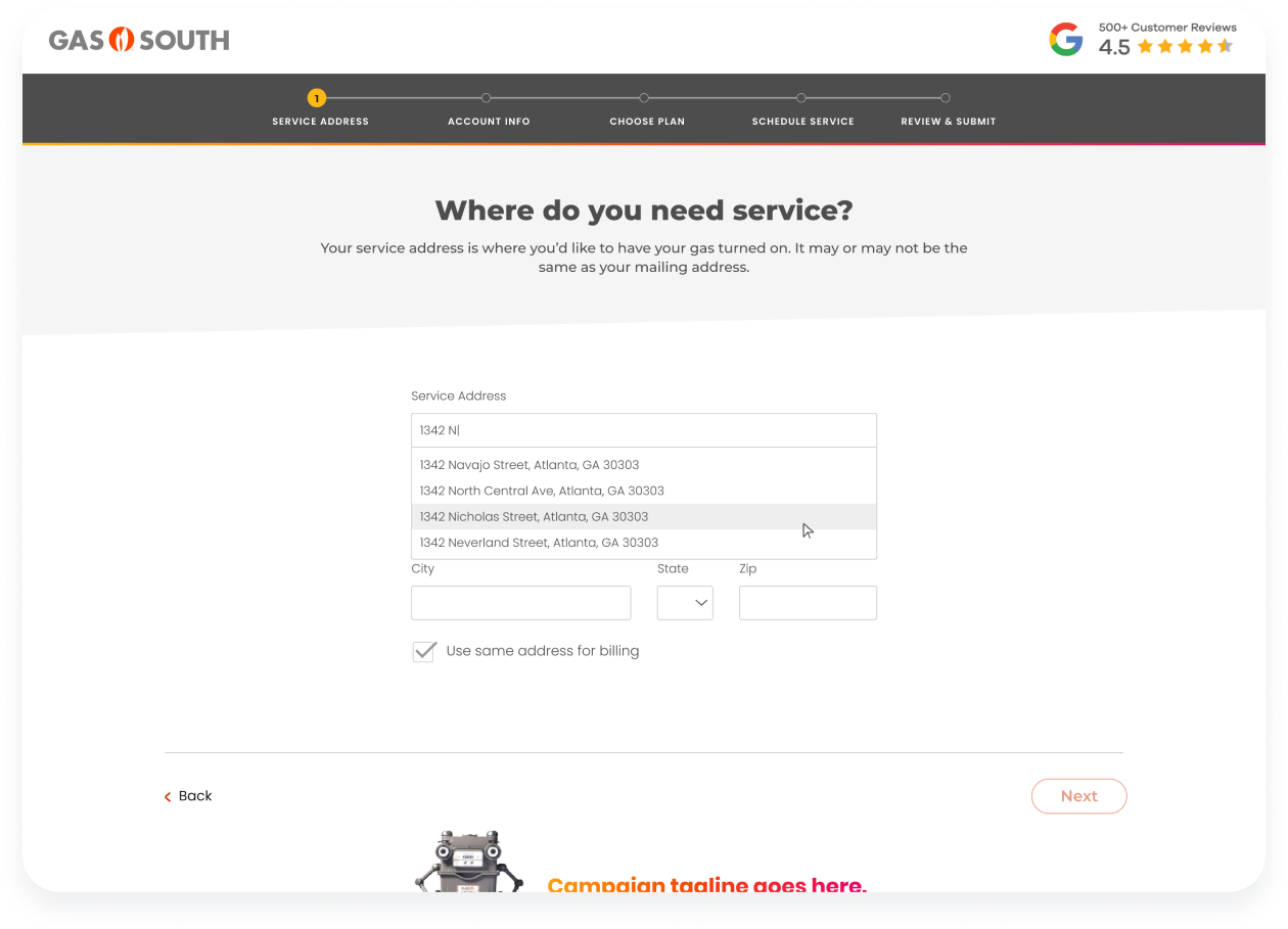
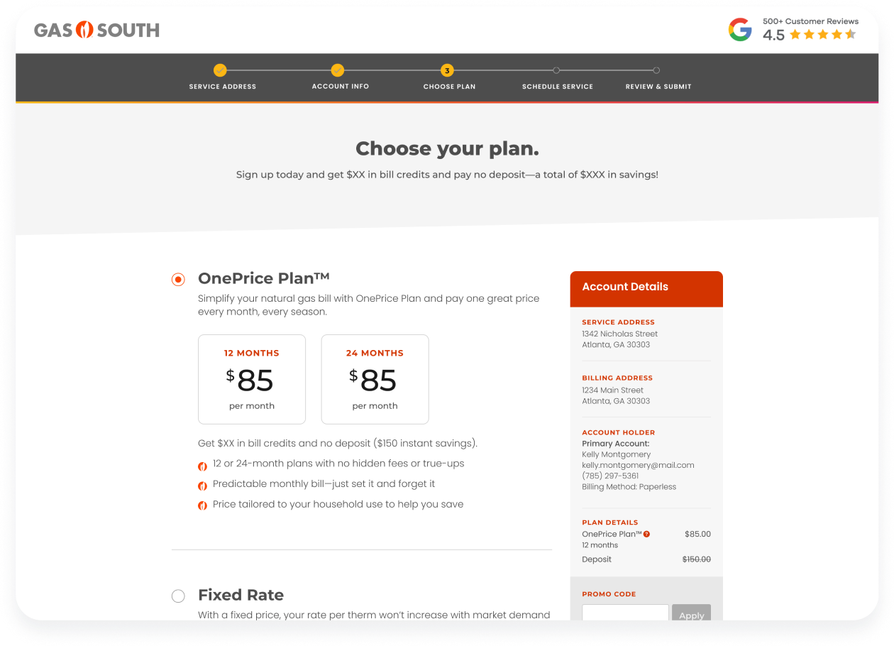
- By having the customer verify the service address first, it allows the system to check if Gas South can service that area.
- Next, having a credit check before choosing a plan shows only the plans the customer is eligible for.
- Finally, when choosing a plan, customers can see all pricing, fees, and information before committing.
SERVICE DATE
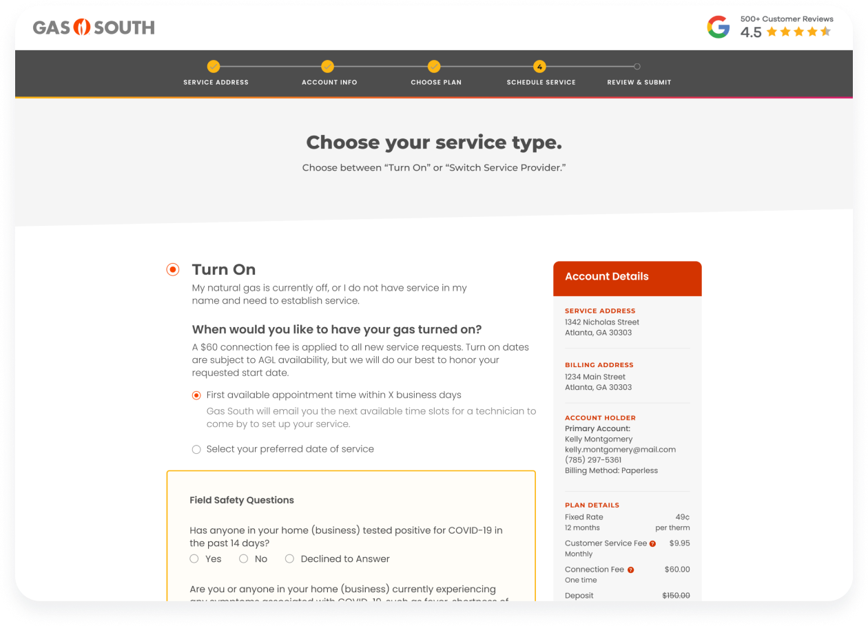
The copy is carefully written to inform customers that the service date they choose is subject to AGC availability and scheduling, but Gas South will make every effort to honor their requested date.
ENROLLMENT STATUS
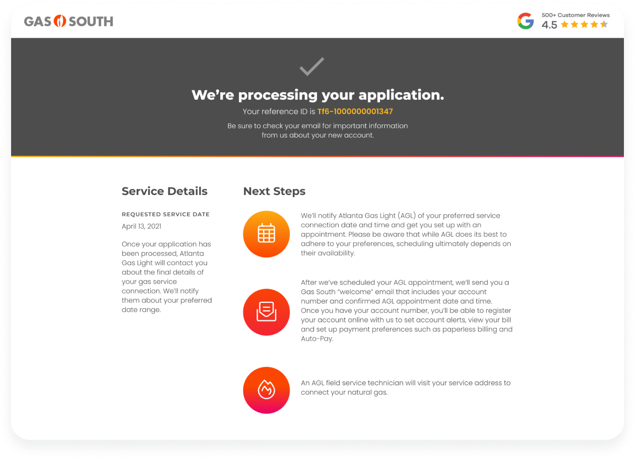
Once submitted, customers can come back to this page to see their service details and next steps.
Takeaway
This project is one of my best use cases for how research can make a design more thoughtful and relevant to users—in this case, an enrollment flow. Each conversation, whether with a stakeholder or customer, helped me understand the business and its challenges. While the design may be utilitarian, the research behind it made this project a big success for Gas South.
Selected Works
A new visual styleVisual Design, Design System
A scalable mobile banking appProduct Design, UX Research

1 configurator for 14 productsProduct Design, UX Research